Steep cheat sheet by the combination of colors
Color - a qualitative subjective characteristic of electromagnetic radiation of the optical range, determined on the basis of the emerging physiological visual sensation and depending on a number of physical, physiological and psychological factors. The perception of color is determined by the individual's personality, as well as by the spectral composition, color and brightness contrast with the surrounding light sources, as well as non-luminous objects. Very important are such phenomena as metamerism, individual hereditary features of the human eye (the degree of expression of polymorphic visual pigments) and the psyche.
In simple terms, color is a sensation that a person receives when he hits the eye with light rays. A stream of light with the same spectral composition will cause different sensations in different people due to the fact that they have different perception characteristics of the eye, and for each of them the color will be different. Hence it follows that disputes, "what color is really", are meaningless - only the measurement of what is "really" the composition of the radiation has meaning.
The right combination of colors is one of the most important components of your image and a stylish, holistic interior. That's why we decided to share a cheat sheet with which you definitely will not miss the selection of colors for choosing clothes or choosing the design of your perfect apartment.
The color scheme consists of 12 basic colors. Three basic (primary), three composite and six third order. In the color gamut, these groups are located at an equal distance from each other.
The main colors are red, blue and yellow: because they can not be obtained by mixing other colors.
COMPOSITE colors (green, orange, purple) are obtained by mixing the two primary colors: blue and yellow colors give a green color; Red and yellow - orange; Blue and red - purple.
TERTIARY (colors of the third order) are obtained by mixing the main and composite colors: red-violet, yellow-orange, blue-green, blue-violet, yellow-green and red-orange.
ADDITIONAL colors in the color circle are located strictly opposite to each other and when mixed give neutral colors.
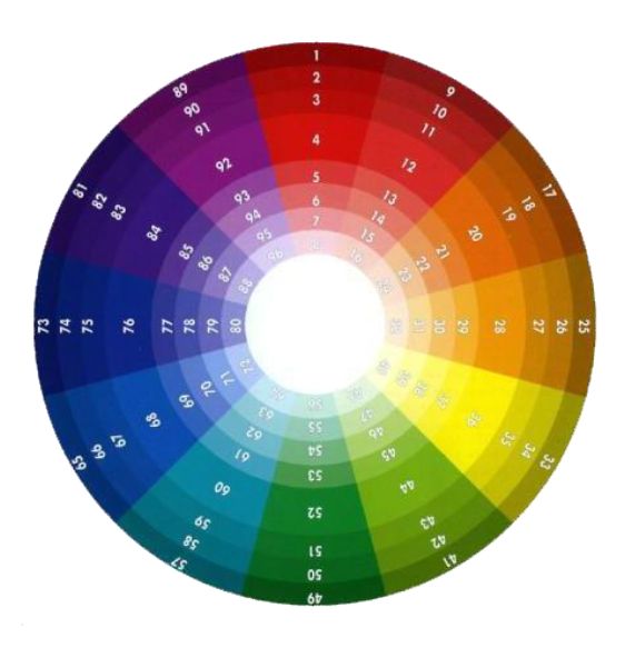
Pure and bright colors are located in the wide central ring of the color circle (numbers 4, 12, 20, 28, 36, 44, 52, 60, 68, 76, 84 and 92).
In the four inner rings there are shades of the original color with the addition of a different amount of white, and in the three outer rings - with the addition of black.
The choice of colors is a fairly important occupation. The combination of colors in design has always been the main of the main tasks (make sure the color combinations are important, this is important)!
The color scheme should not be strained or unnerving, but, conversely, return the harmony spent during the day. The choice of colors begins with a decision, what do you want from the design of the color (product or decor)? Only in this way you can choose the best combination of colors.
And how to use the color wheel? Yes, everything is very simple. There are several rules for selecting colors, which can easily be combined with colors for interior design. Consider them.
Scheme 1. Complementary combination
Complementary, or additional, contrast, are the colors that are located on opposite sides of the color circle of Itten. Their combination looks very vivid and vigorous, especially with maximum color saturation.
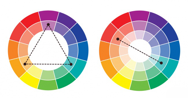
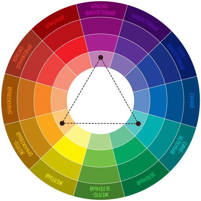
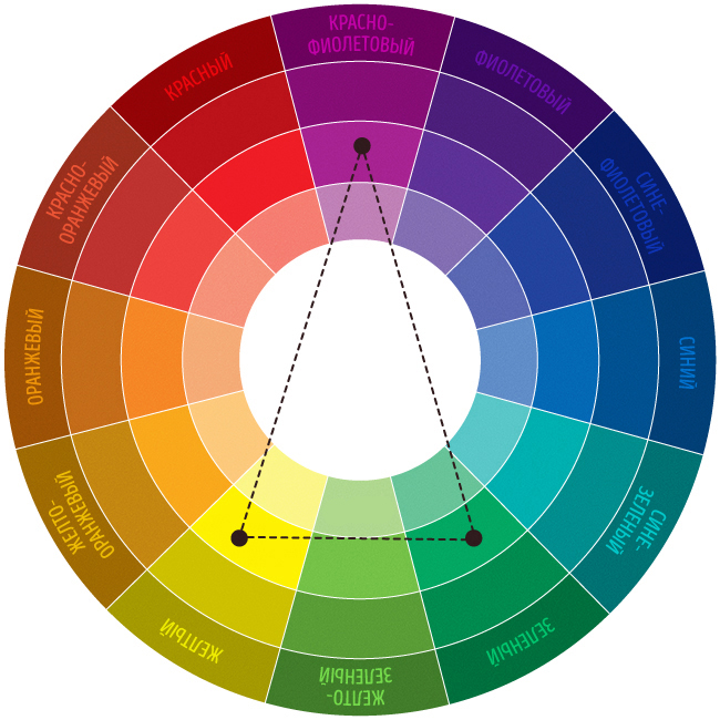
Scheme 2. Triad - a combination of 3 colors
The combination of 3 colors, lying at the same distance from each other. Provides high contrast while maintaining harmony. Such a composition looks quite alive even when using pale and unsaturated colors.
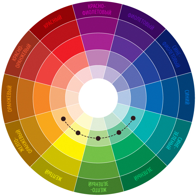
Scheme No. 3. A similar combination
The combination of 2 to 5 colors, located next to each other on the color wheel (ideally - 2-3 colors). Impression: calm, disposable. An example of a combination of similar muffled colors: yellow-orange, yellow, yellow-green, green, blue-green.
Scheme No. 4. Separate-complimentary combination
The variant of a complementary combination of colors, but instead of the opposite color, the neighboring colors are used. The combination of the main color and two additional colors. This scheme looks almost as contrasted, but not so tense. If you are not sure that you can correctly use complementary combinations, use separate complimentary ones.
Scheme № 5. Tetrada - a combination of 4 colors
Color scheme, where one color - the main one, two - complementary, and one highlights the accents. Example: blue-green, blue-violet, red-orange, yellow-orange.
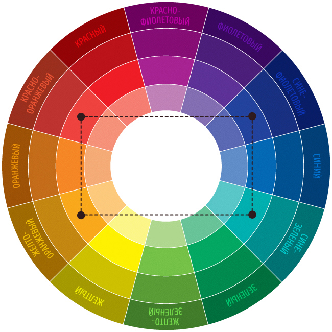
Scheme № 6. Square
The combination of 4 colors, equidistant from each other. The colors here are dissimilar in tone, but also complimentary. Due to this, the image will be dynamic, playful and bright. Example: violet, red-orange, yellow, blue-green.
Combinations of individual colors
- White: combined with everything. The best combination with blue, red and black.
- Beige: with blue, brown, emerald, black, red, white.
- Gray: with fuchsia, red, purple, pink, blue.
- Pink: with brown, white, the color of green mint, olive, gray, turquoise, tender blue.
- Fuchsia (dark pink): with gray, yellow-brown, lime, green mint, brown.
- Red: with yellow, white, brown, green, blue and black.
- Tomato red: blue, the color of green mint, sandy, creamy white, gray.
- Cherry red: azure, gray, light orange, sandy, pale yellow, beige.
- Raspberry red: white, black, the color of a damask rose.
- Brown: bright blue, cream, pink, fawn, green, beige.
- Light brown: pale yellow, cream white, blue, green, purple, red.
- Dark brown: lemon yellow, blue, green mint, purple-pink, lime.
- Tan: pink, dark brown, blue, green, purple.
- Orange: blue, blue, purple, purple, white, black.
- Light orange: gray, brown, olive.
- Dark orange: pale yellow, olive, brown, cherry.
- Yellow: blue, purple, light blue, purple, gray, black.
- Lemon yellow: cherry red, brown, blue, gray.
- Pale yellow: fuchsia, gray, brown, shades of red, tan, blue, purple.
- Golden-yellow: gray, brown, azure, red, black.
- Olive: orange, light brown, brown.
- Green: golden brown, orange, salad, yellow, brown, gray, cream, black, creamy white.
- Salad color: brown, tan, pale, gray, dark blue, red, gray.
- Turquoise: fuchsia, cherry red, yellow, brown, cream, dark purple.
- The electrician is beautiful in combination with golden yellow, brown, light brown, gray or silver.
- Blue: red, gray, brown, orange, pink, white, yellow.
- Dark blue: light purple, blue, yellowish green, brown, gray, pale yellow, orange, green, red, white.
- Purple: orange, pink, dark purple, olive, gray, yellow, white.
- Dark purple: golden brown, pale yellow, gray, turquoise, the color of green mint, light orange.
- Black is universal , elegant, looks in all combinations, best with orange, pink, salad, white, red, lilac or yellow.
Via decor-design.justclick.ru




Comments
Commenting on, remember that the content and tone of your message can hurt the feelings of real people, show respect and tolerance to your interlocutors even if you do not share their opinion, your behavior in the conditions of freedom of expression and anonymity provided by the Internet, changes Not only virtual, but also the real world. All comments are hidden from the index, spam is controlled.