
Maps that will change your view of the world forever

Scientists to this day did not agree on how to correctly map the relief of a spherical planet on a flat sheet of paper. It's like drawing a card on a mandarin, peeling off and trying to squash it into a rectangle. It is clear that the regions close to the "poles" will have to be greatly stretched.
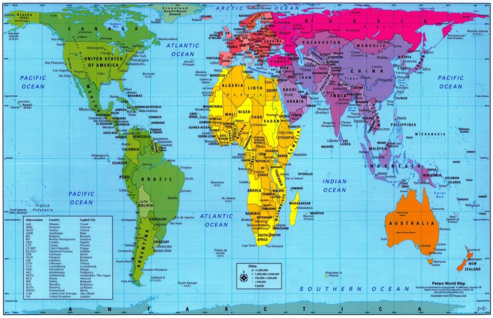
We all use the projection of Gerard Mercator, but it has a drawback: the closer islands and countries are to the poles, the more they seem. The site thetruesize.com is created so that we can better represent the real dimensions ratio on the map.
The true size of Greenland
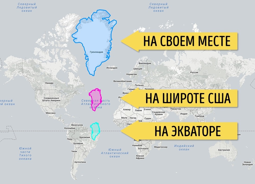
First, look at Greenland. A big island, is not it? Almost like South America. But when Greenland moves to the latitude of the USA, it can be seen that it is not that big. And when you transfer to the equator, it is completely clear that this is just an island, and not a giant island.
But what would have happened, being Australia in the breadth of Russia and Europe
It seems that Australia is small. First, it is close to the equator, and secondly - it is distant from other continents and there is nothing to compare it with. But look at these maps.
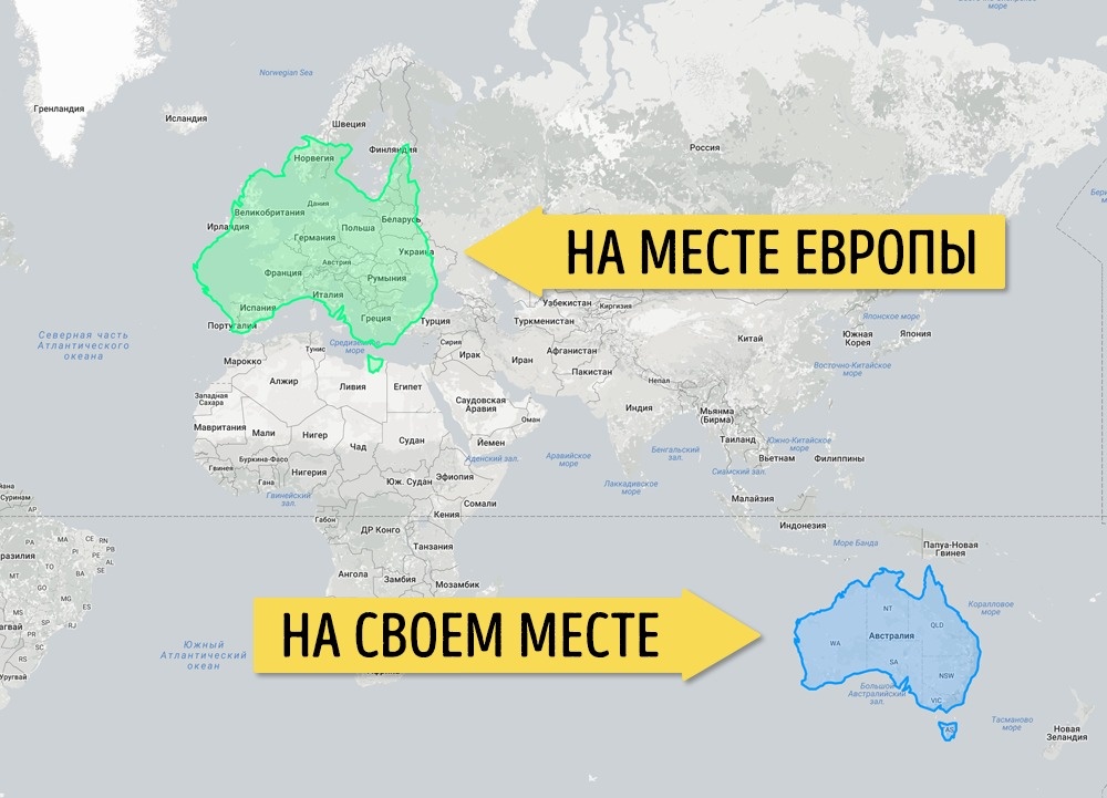
Notice how the shape of Australia changed when moving to the North. This is because part of it is located behind the Arctic Circle, that is, very close to the pole, and it is stretched out on the projection.
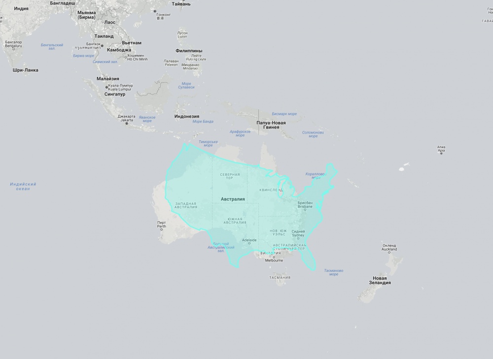
But the USA (without Alaska) in comparison with Australia. As it turned out, they are almost the same in size
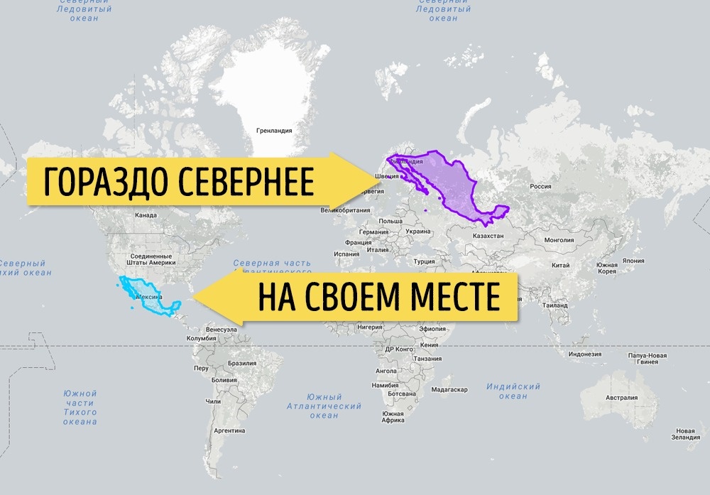
Mexico, it turns out, is a fairly large country
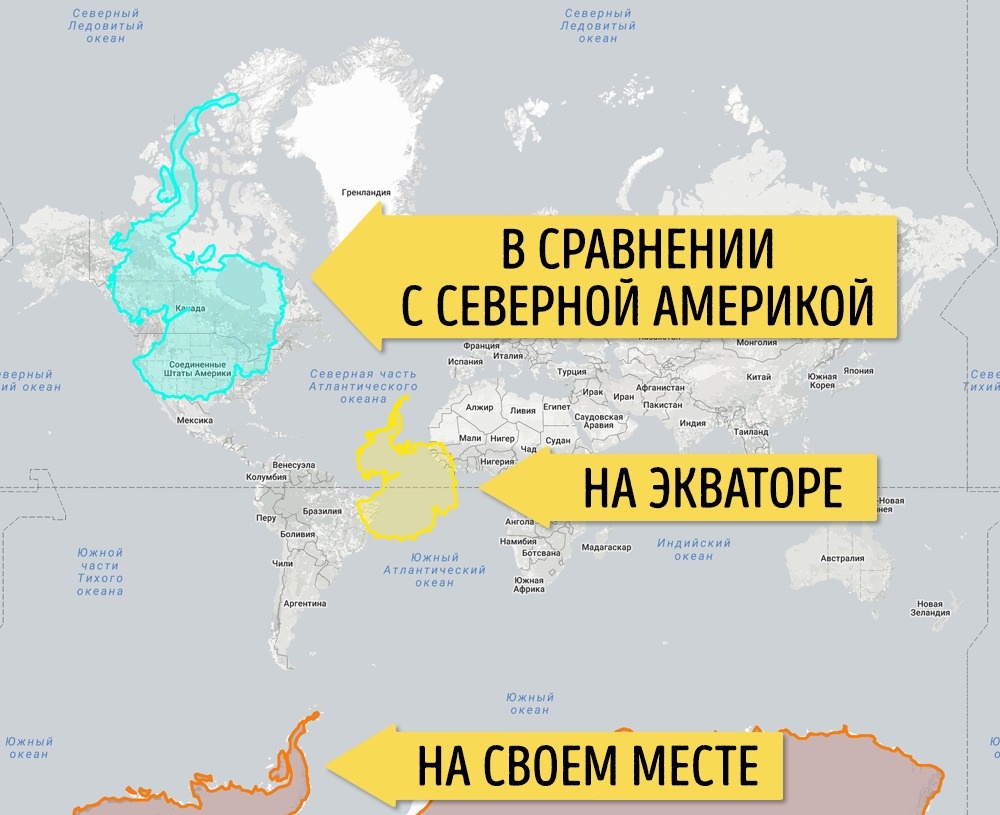
But the real size of the most mysterious continent is Antarctica
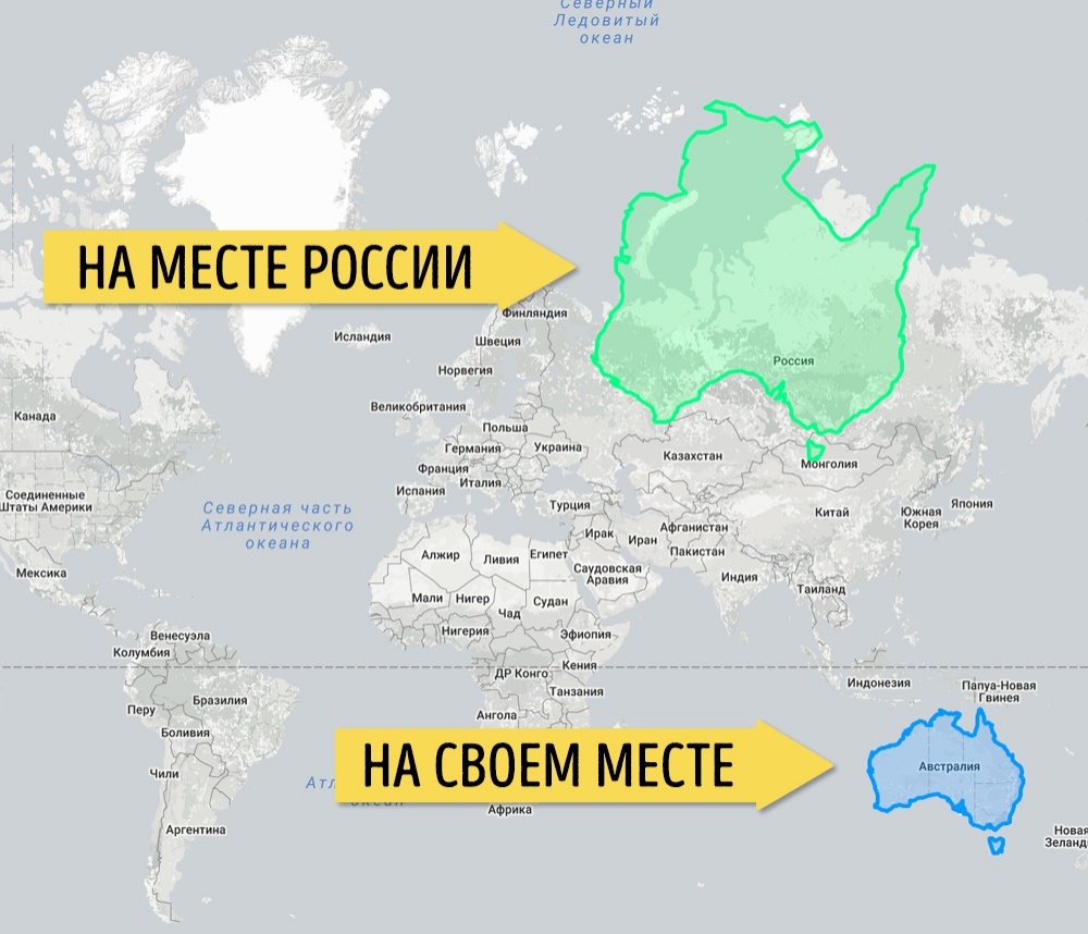
What about the true size of Russia?
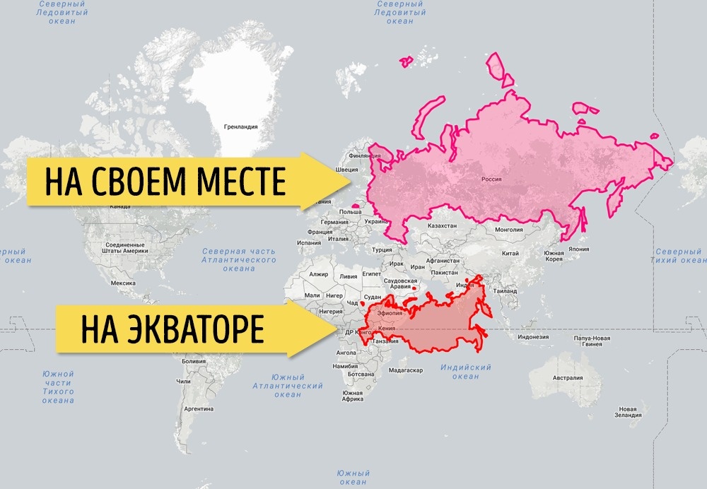
Russia is not only the largest country, but also the most northern one. That's why on the map it looks just a giant, which is even larger than many continents. But by transferring Russia to the equator, we will see that it has decreased two to three times.
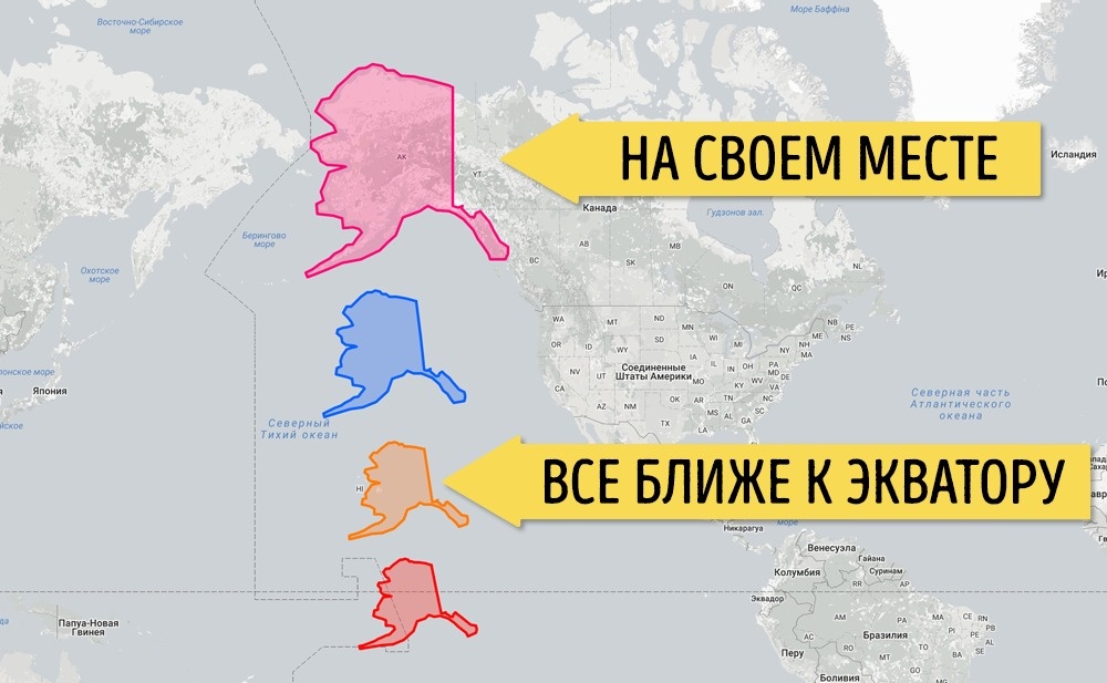
And this is how the dimensions of Alaska gradually change as they move to the equator
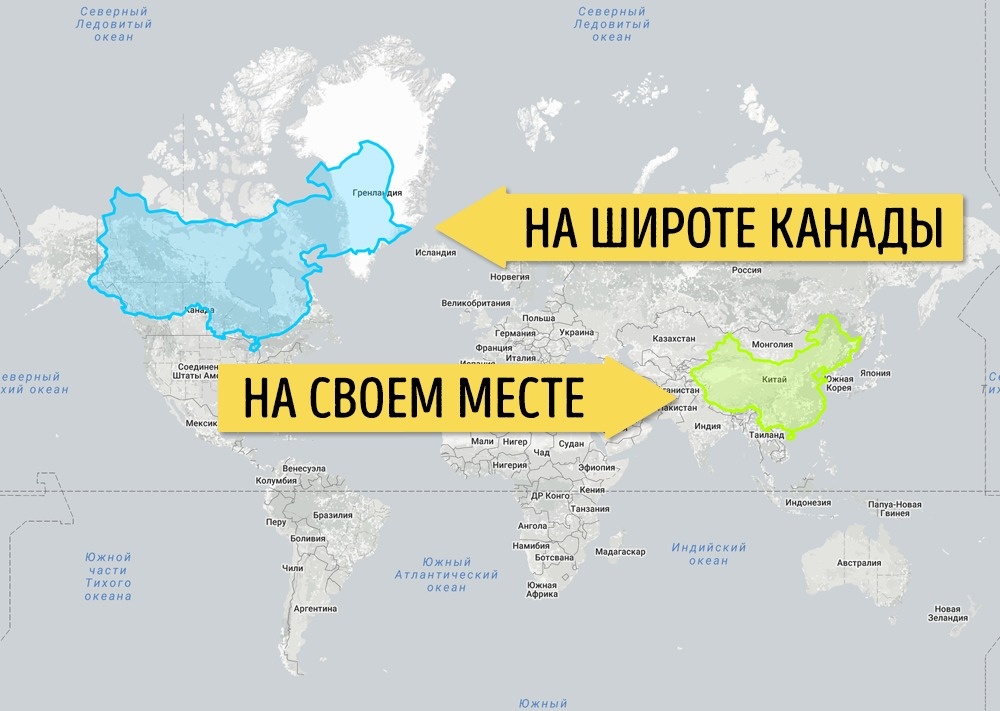
So would China look if it were a northern country like Canada
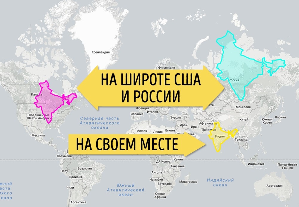
India in comparison with Russia and the US is not so small as it seems
If the Democratic Republic of the Congo were in Europe, there would be almost no place for other countries
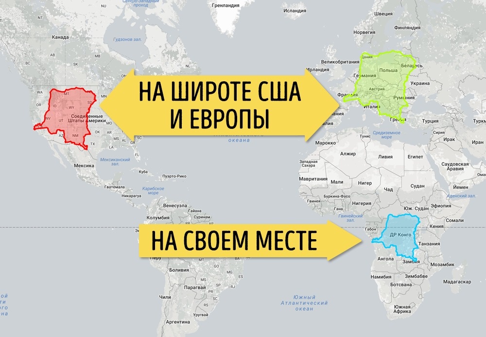
All countries on the African continent look small. It's all because they are located on the equator. Look at how the Republic of the Congo has covered almost half of the US and most of Europe.
The largest African countries in the breadth of Russia
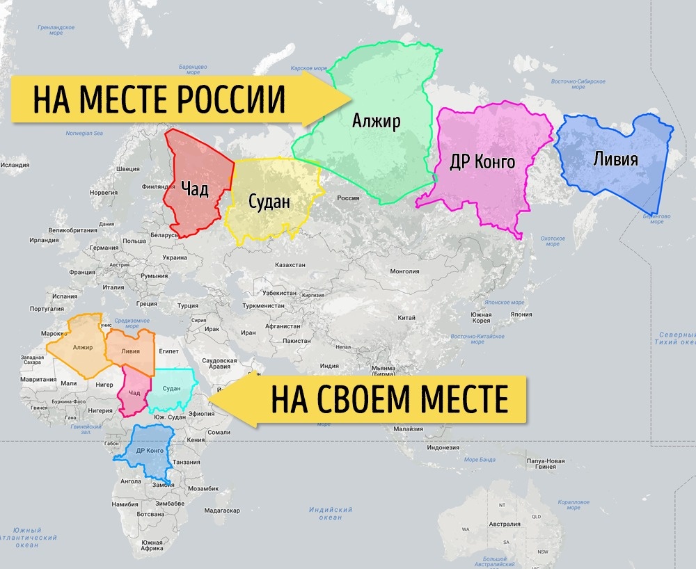
Algeria, the Democratic Republic of the Congo, the Sudan, Libya and Chad are quite large countries, but usually this is not visible due to their situation. In fact, if these five countries are "blinded" together, they will be almost the same as Russia in terms of area.
We will locate the six largest countries along the equator. Now they are on equal terms
Russia, of course, is still huge, but not such a supergiant as it seems, being in its latitudes. And here you can see how great Australia is.
Other existing cartographic projections, with which scientists are trying to solve the problem of believable image of the Earth's relief.
The Galla-Peters projection
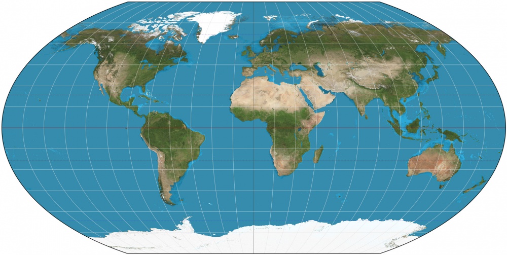
Projection of Wagner
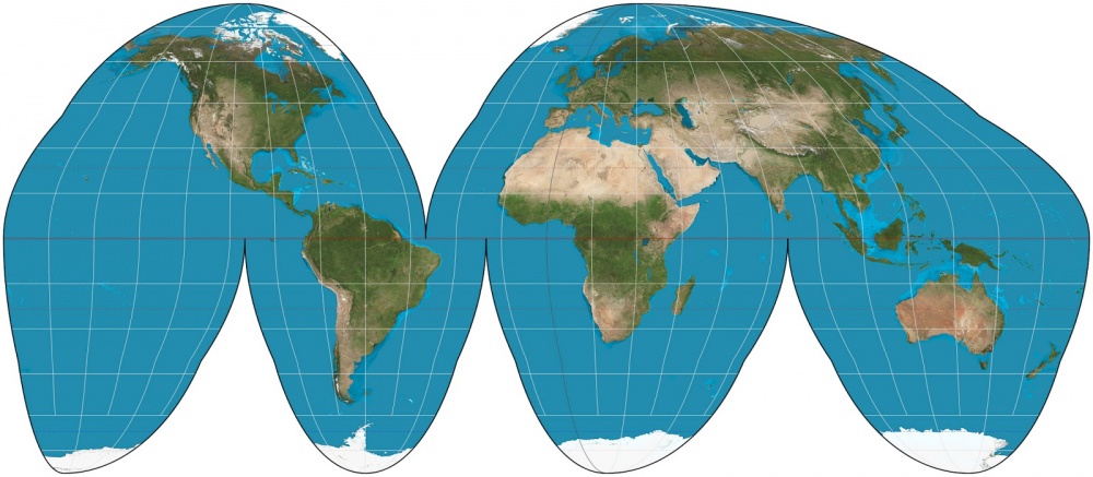
Projection Hood

Comments
When commenting on, remember that the content and tone of your message can hurt the feelings of real people, show respect and tolerance to your interlocutors even if you do not share their opinion, your behavior in the conditions of freedom of expression and anonymity provided by the Internet, changes Not only virtual, but also the real world. All comments are hidden from the index, spam is controlled.