Classification of fonts
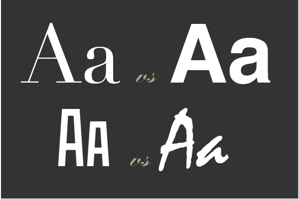
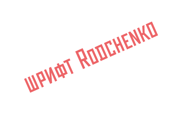
Orchest from the poster font Rodchenko , on business broadcasts Times New Roman and turns on paper his Edwardian Script dance. Fonts are not invented for the sake of a red word, but in order to more clearly convey the meaning of the text, this is such a dress, which they meet. And, secondly, it's just beautiful.
At first glance it seems that in the whole history of writing, so many fonts have been invented, that it is simply impossible to understand them. In fact, everything is much simpler and all these endless variations of circles and sticks fit easily into a slender and simple system.
All fonts are divided into four large groups, like the seasons or the side of the world:
1. antiquated serif
2. grotesque without sans serifs
3. handwritten , imitating human handwriting
4. Accidental for headlines and posters.
- Antiqua -
Style: academic, classical, traditional, conservative, elegant.
Where to find: business newspapers, scientific articles, books, textbooks, documentation.
If the fonts could be compared with civilizations, the antiquity would undoubtedly be a representative of the Western. These fonts are formal, rigorous and have the longest history. They have traditions and manners. The peculiarity of the antique, as already mentioned, serifs - starched collars and cuffs of letters, elements that make the font more stable, more thorough, more accurate. Antique well manages to convey the meaning of business documents, scientific reference books and articles, large voluminous texts. The businessman with the newspaper most likely runs through the eyes of the antique, the student who passes the session, deals with serifs.
- Antique old style -
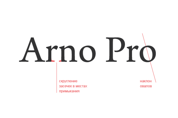
Rounding of serifs in places of contiguity to the main stroke and inclined axis of oval elements, moderate contrast. Examples: Arno Pro , Adobe Garamond , Bembo , Dante , Stempel Garamond , Granjon , Poliphilus , Sabon .
- Transitional Antique -
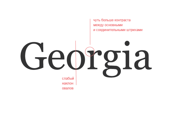
The difference between the main and connecting lines in the transition antique is more obvious than in the old style, but less clear than in the antique style of the new style. Examples: Times New Roman , Baskerville , Caslon , Georgia and Bookman .
- antiqua of a new style -
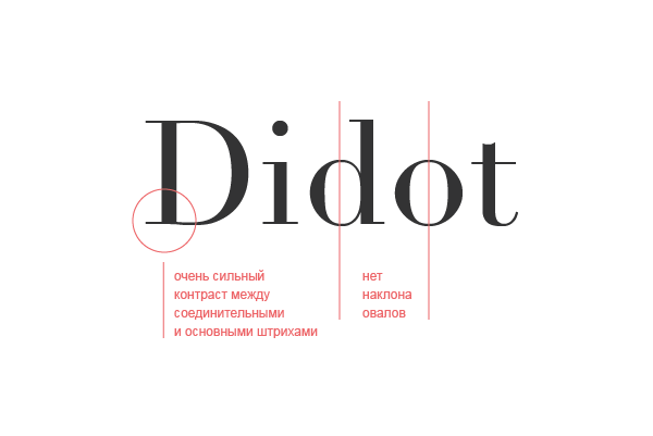
It differs by a stronger contrast between the main and connecting lines, strictly vertical ovals, thin and long serifs. Examples: Didot and Bodoni .
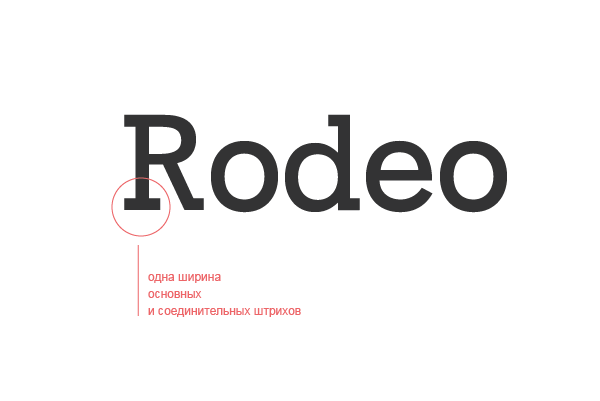
- squared antiqua-
The difference between the main and connecting lines is either barely noticeable, or it is not at all, the serifs are powerful, rectangular in shape. As, for example, GoDesigner headers .
- Grotesque, he's chopped -
Style: modern, light, neutral, functional.
Application: business, technical and electronic documents, educational literature, architecture, the Internet and digital technologies.
This is undoubtedly the font north - minimalistic, clear, functional and straightforward, like a wardrobe from Ikea, which does not tolerate any excesses, such as serifs of antiquity or hand-written fonts. These elements, like atavism, disappeared as useless. Grotesque fonts are a new story, constructivism and Bauhaus, space and computers. Facebook tape is grotesque Gotham. Companies Microsoft, Panasonic and even NASA use the ubiquitous Helvetica.
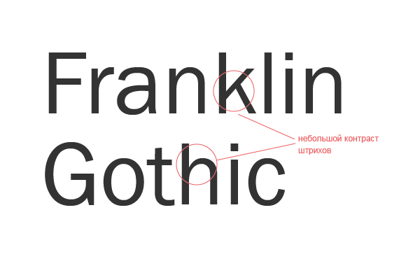
- old grotesques -
The transition link in the font evolution from antiquity to the grotesque, letters with a slight contrast. Examples: Franklin Gothic and Akzidenze Grotesk .
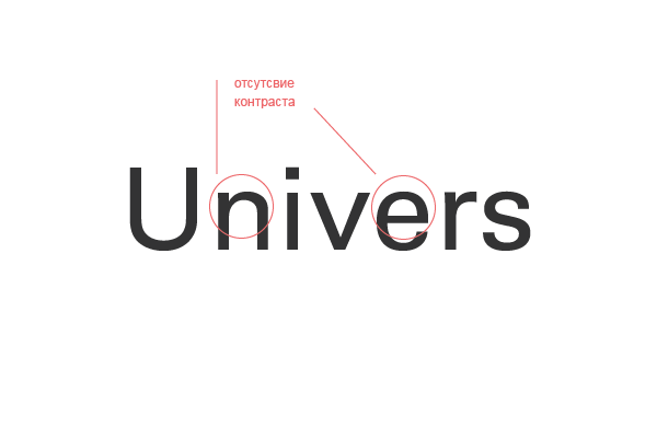
- new grotesques -
The most neutral, single-width fonts are almost without contrast. Examples: MS Sans Serif, Arial, Helvetica and Univers .
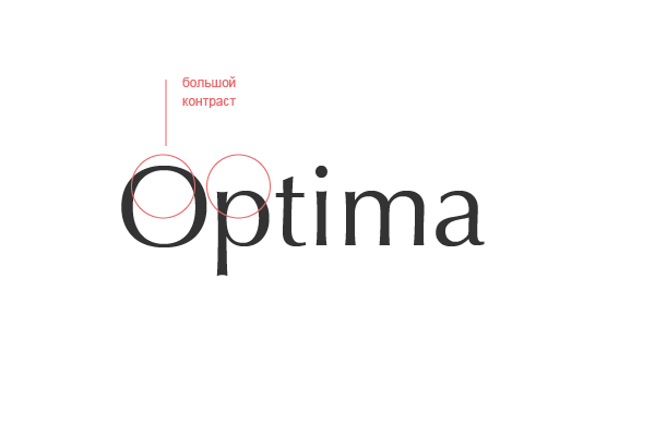
- Humanistic grotesques -
Have a greater contrast in the thickness of the strokes. And they are not called humanistic by chance, but because they remind the handwritten ones (pen). Examples: Gill Sans , Frutiger , Tahoma , Verdana , Optima , and Lucide Grande.
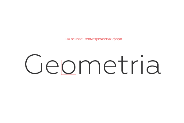
- geometric grotesques -
As the name implies, they are built on the basis of geometric shapes. An example: Futura and Geometria .
- Handwritten fonts -
Style: poetic, artistic, decorative.
Application: the design of invitations, albums, exquisite headlines, signs, greeting cards.
Imagine a concentrated Chinese master taking out hieroglyphs with a pen. Yes, handwritten fonts are beautiful, fickle and elegant, like the east. They circulate their strokes like Turkish dervishes, and are more like Arabian ligature and hieroglyphics. In manuscript fonts there is too much inconsistency, therefore they seem more humane and can serve classical poetry (as, for example, formal) and contemporary street art (as informal). But too much on them you will not read - in large volumes they become cloying, like halva. Handwritten fonts are easy to distinguish at the end of scripts in the title.
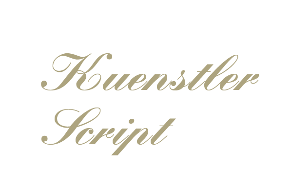
- formal handwritten -
Most often italic, with a lot of monograms, a sort of baroque font. Examples: Kuenstler sript.
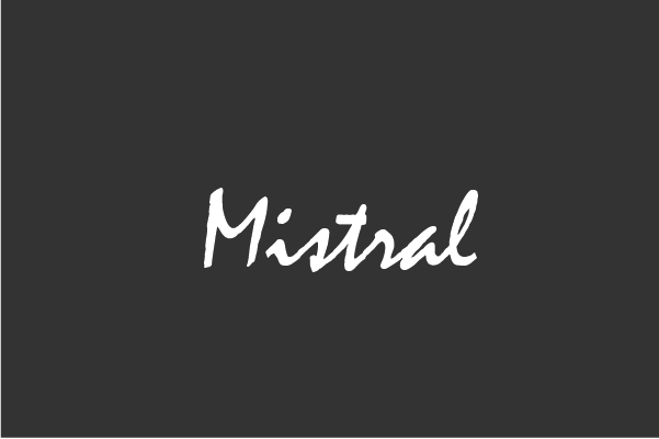
- informal handwritten -
Not as old-fashioned as formal and in principle, similar to most of the handwriting of a modern person who does not have a calligraphic skill. Examples: Mistral and Brush script.
- Accentional fonts -
Style: decorative, folk, fantasy.
Application: advertising , signs, logos, headings.
These are all strange, stylized, artistic, designer and slightly abnormal fonts. Read with their help large amounts of text - it will be hardly possible. They can only frame him, be such a cherry on the cake. The accidents do not know the rules, their outlines are limited only by the imagination of the designer. They can be compared to the diverse diversity of the south: exotic flora and fauna of the jungle or magical ornaments of African tribes. Advertising, signage, headlines, logos, in short, everything that fits in two or three words is the habitat of this group.
Via godesigner.ru


Comments
When commenting on, remember that the content and tone of your message can hurt the feelings of real people, show respect and tolerance to your interlocutors even if you do not share their opinion, your behavior in the conditions of freedom of expression and anonymity provided by the Internet, changes Not only virtual, but also the real world. All comments are hidden from the index, spam is controlled.