
Create a button in Web 2.0 style in PhotoShop
In this lesson I'll show you how you can make a simple, but at the same time beautiful, Download-button in the modern and all loved Web 2.0 style. Download - as an example, you can use this method for anything, even for the menu on the site. So, to the point.
1. Create a new document or open a layout design for the web page, if you want to create a menu of these buttons. I created a document of 400x110px size, just for the button.
2. Next, use the Rounded Rectangle Tool (U) to create the button shape.
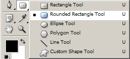
In the settings, set the radius to smooth the corners of 10-15px , you can choose other values, depending on the size of the button.

Now create a form on the canvas, the color of the shape now does not matter.

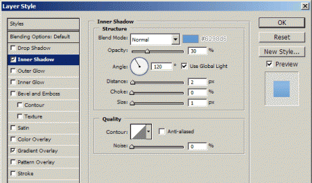
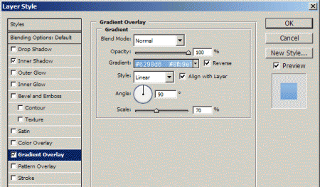
3. Now set the layer styles for our shape. Go to the properties of Blending Options (double click on the layer next to the name in the layer palette or through the Layer> Layer Style menu .> Blending Options ) and set the values as shown in the screenshots:
Inner Shadow:
Gradient Overlay:
You can use whatever color you want, but the button should look like a 3D, like this:

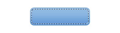
4. Now it's time to add a nice glossy effect to our future button. Create a selection in the form of our button, you can do this by holding down Ctrl by clicking on the layer icon on the layers palette. Next, reduce it by about 5 pixels from all sides. To do this, go to Select> Modify> Contract and enter 5 in the window that appears. This is how it should look:
Now create a new layer and fill our selection of gradients from White to transparent from top to bottom. Like this:

Next, we need to make a curve using the Pen Tool, make a curve directly over the selection by enclosing the bottom of the white gradient of the button in it and delete it. Here's what I got:

I also used a large soft brush to remove some of the edges (softening), so they look much better.
5. Now add the text to our button. We take the Horizontal Type Tool (T) and write the desired text.

For the top text I used the font Black Italic, 24 pt, Sharp, #fff , for the bottom - Semibold Italic, 12 pt, Sharp, #fff and added a shadow in the Blending Options properties:
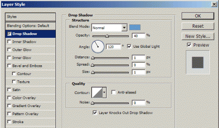
Drop Shadow:
This is how it looks:

In conclusion, I added a reflection and a gear for beauty. If you want, you can download it here

And the red version 


Comments
When commenting on, remember that the content and tone of your message can hurt the feelings of real people, show respect and tolerance to your interlocutors even if you do not share their opinion, your behavior in the conditions of freedom of expression and anonymity provided by the Internet, changes Not only virtual, but also the real world. All comments are hidden from the index, spam is controlled.