Scalable iOS 7 review
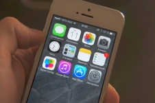
The first beta version of iOS 7 is in our hands. We hasten to share all the innovations of the most radical version of the mobile operating system Apple. There will be many terrible icons, simple gradients and minimalism, raised to the absolute. And there will be very, very many new functions, many of which must be seen with my own eyes. And maybe not.
Video review iOS 7 Kostya Gribanova
Initial setup of iOS 7
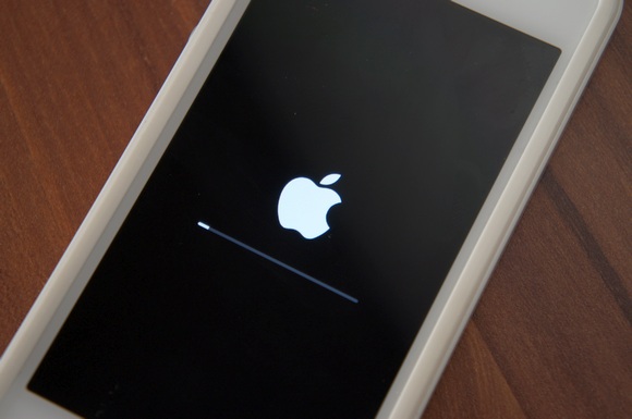
IOS 7 meets the user with an introductory setup screen after reinstalling the system or completely resetting the data. But the new design is noticeable even earlier - at the time of installing the firmware. The traditional Apple logo finally became a flat figure, and the progress bar became thinner.
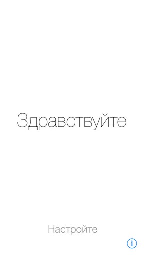
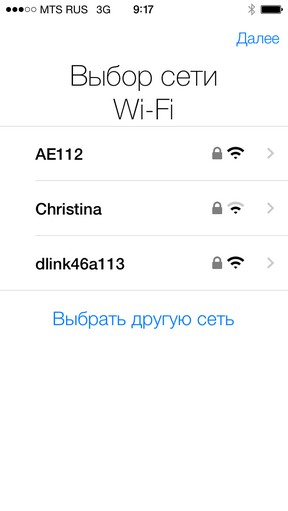
And from the first seconds comes to mind Windows Phone. The new system font shows itself in all its glory and different languages, which are replaced with a greeting every three to four seconds. By the way, the screen now "falls asleep" gradually - comparable to how it will be if you blink slowly 
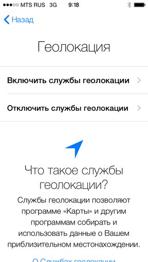
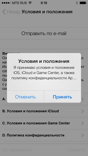
The stages of the initial setup are generally similar to those in iOS 6. Choose a Wi-Fi network, enter the password from it and wait for the device to activate. If you wish, we turn on geolocation and accept the Terms and Conditions for using iOS. It is not necessary to read them again.
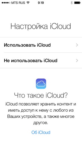
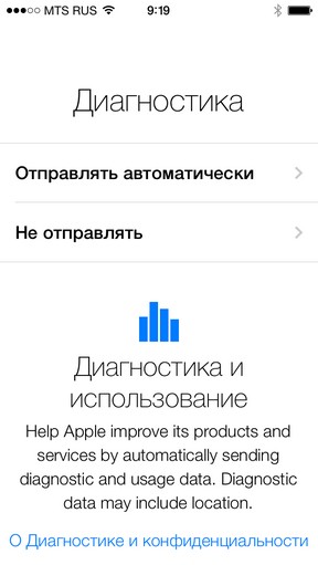
In addition, you can turn on iCloud, log into your Apple ID account, configure Find My iPhone and enable the sending of diagnostic data.
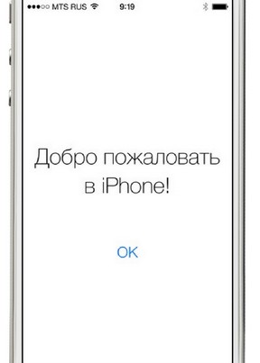
Welcome to iOS 7.
Lock Screen in iOS 7
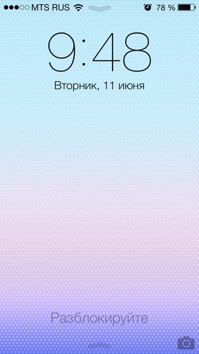
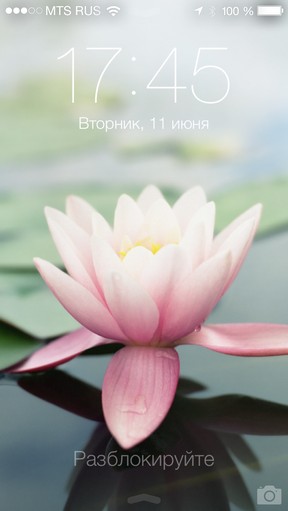
The lock screen of the system has undergone drastic changes. Say goodbye to the Slide to Unlock slider : now its place is occupied only by the corresponding inscription without background or background. The background image no longer uses a blackout filter or any gradients: how it is set, it will look like. Time has not moved anywhere, and the date is displayed below it.
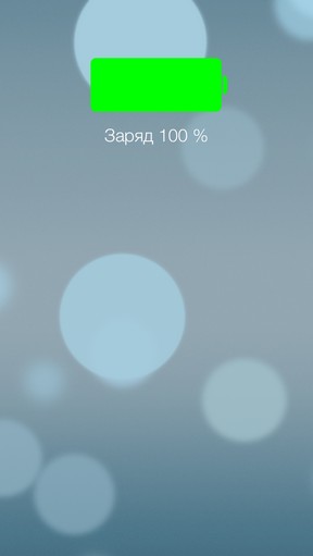
When the charger is connected, the battery charge status is displayed for a short time. Then it gives way to the standard lock screen. So with the old picture of the green battery, we also say goodbye.

Right here, under the time, the list of the latest notifications from applications is shown. This list loosely scrolls up and down and contains the program icon, time and text of the alert, which clearly became more than a dozen characters. To go to the application from the notification, just click on it.
The camera is called up by the svipom from the corresponding icon. To unlock the device, you just need to hold a finger from left to right anywhere. You can lead to the left, but there's nothing there.
Desktop iOS 7. General changes
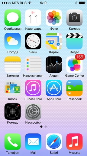
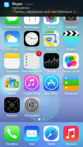
The home screen is considered a symbol of iOS, and from this symbol there is perhaps only a grid of icons. The corners of these icons are now rounded up stronger than before. Color diversity plus extreme schematics create a very strange impression. Users with experience will feel uncomfortable and, probably, will want to immediately postpone this disgrace to the side.
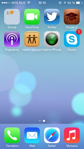
And when you try to put it, you will notice a new effect of the 3D desktop . The background of the screen and the icons change their position depending on the angle of the device. To notice this is not so easy, and even in Apple's commercial, this effect was much more pronounced. It works quite well for itself, but it is interesting, whether it is possible in the future to turn it off in the settings to save energy or, conversely, to increase the amplitude of the movements.

The status bar now shows the receive level of the signal in the form of five points. The name of the operator and the battery charge in percent are rewritten by the system font. The Wi-Fi icon has not changed, but the BT icon is a little thinner. Finally, the battery icon was extended like a tax, and the charging logo was placed not directly on it, but to the right, in the corner of the display. The icon itself seemed to come off Android.
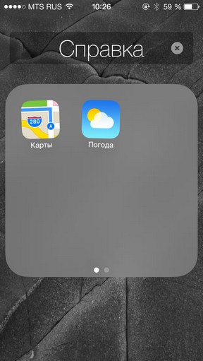

Folders now have a translucent substrate and are expanded to full screen with the zoom effect, completely hiding both the dock and all other applications on the desktop. The editing and renaming system works as before. There are 9 applications on one screen of the folder, but you can create several additional pages inside. The pages are turned the same way as those on the desktop.
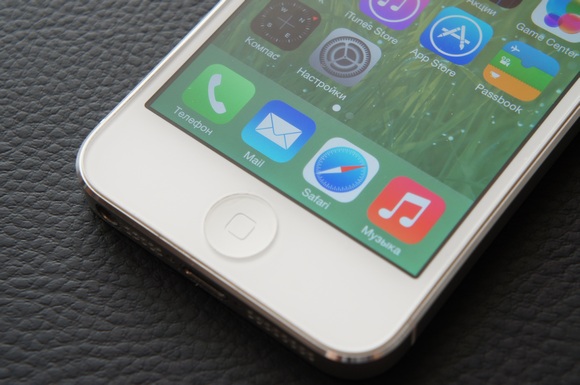
The background of the application dock has changed dramatically. Instead of a glass shelf - a rectangle in the entire block of programs, blurring the background image. Due to the lack of its own color, the dock adapts to any background image and therefore practically does not stand out. As before, you can insert only 4 applications. Folders from the dock open without animation - apparently, it has not yet been thought through.
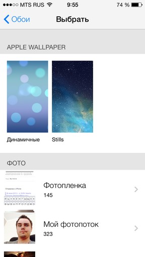
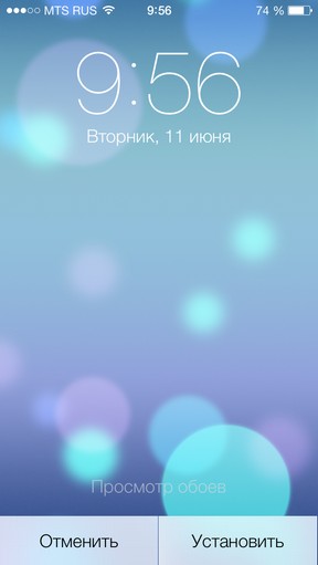
Looking ahead, in the Settings appeared the choice of animated wallpaper . So far, there are two generally identical versions, very similar to the standard wallpaper in Android 4.0. The difference between the options in color and accents, but small circles move and disappear. The option is curious, but boring. It will be much more interesting if users can buy and download other animated wallpapers. We are waiting for iOS 8.
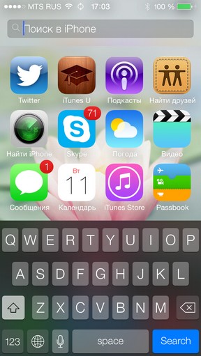
Although not immediately, the absence of a zero screen, where Spotlight used to be located, comes into view. It has not been removed, it's just now it's called by scrolling down the center of the application grid. The string leaves the top panel and takes up ten times less space. I did not have any random triggers. The idea is simple and very appropriate, because the top search line is now in the vast majority of iOS applications.
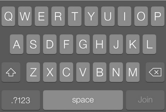
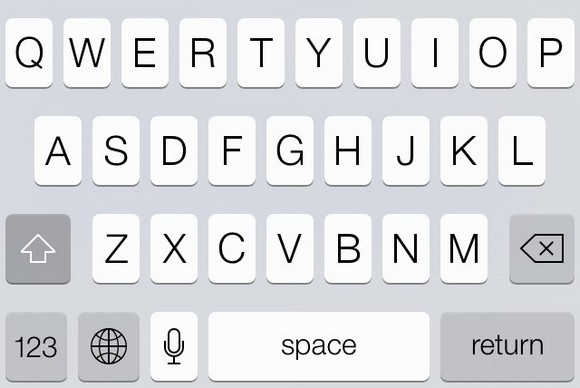
Here and there was a new keyboard iOS 7. From old it differs only in design. But this is enough to distract at first and to enter the text more slowly than before. The font of the letters was expected to be thinner, and not to say that it looks better than before. There were no other changes. In different applications the keyboard has different color schemes: so, on the desktop it is dark, and in the Calendar - light. Emoji's emoticons have not changed.
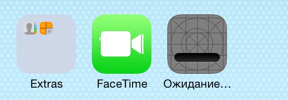
This is the icon for the application that is installed from the App Store. Apparently, Apple thus hints that she tried very hard to create a new design, and did not open Photoshop and threw simple gradients on squares with figures.
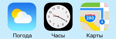
The Clock application now shows the exact time with the moving second hand. After a while the shooter starts to lag slightly, and so on until the next boot. Explicit bug. The calendar, as before, shows the present day of the week and the number.
The built-in recorder application has been removed . Apple expects you will find an equivalent in the App Store.
IOS 7 multitasking system
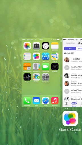
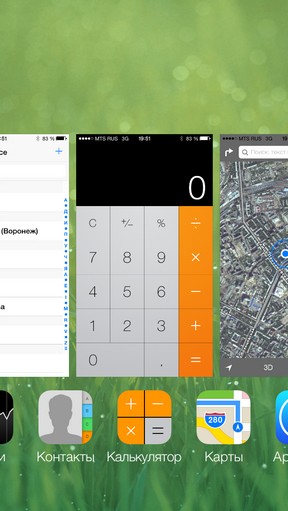
Apple says that iOS 7 has a full multitasking. This is not quite true. The system remained the same: i.e. IOS determines which applications will really work in the background and which ones will be suspended. There was an interesting chip: the system watches when you open certain applications and launches them in advance - this speeds up the loading of information. For example, the Twitter feed will be ready for reading by the time you wake up. It's not Google Now, but it's not bad either.
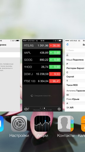
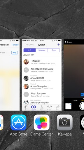
A new multitasking interface causes mixed feelings. The previous mechanism for closing applications was very far from perfect - some of us generally got used to press 4 icons at a time, so as not to knock on the screen for 30 seconds to clear the memory. Now on one screen in portrait mode only three applications fit. To remove them, just swing your finger up. This is the idea of webOS, without options.
IOS 7 Notification Center

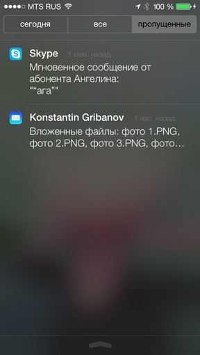
As before, it is called by the swipe down from the top of the screen. But now the whole panel is being pulled down immediately, and not a small "tongue". It is accompanied by a funny "beat" animation about the bottom border of the display and the whole menu bouncing. At the top there are three tabs: Today, All and Missed . Accordingly, the All tab displays all notifications, and Missed - those that you have not yet opened.
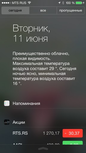
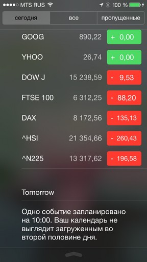
The Today tab is a pumped version of widgets for the Notification Center in iOS 6. Here you can see the Calendar and events in it, the day of the week and the number, as well as the extended weather forecast, not pictures, but text. Russian.
Then there are Reminders, Stocks and the forecast of affairs for tomorrow, including the number and date of the planned events. Freshly. But it's good to disable the calendar or shares, because the tab menu is very long. Fortunately, all this is customizable.
Control point in iOS 7
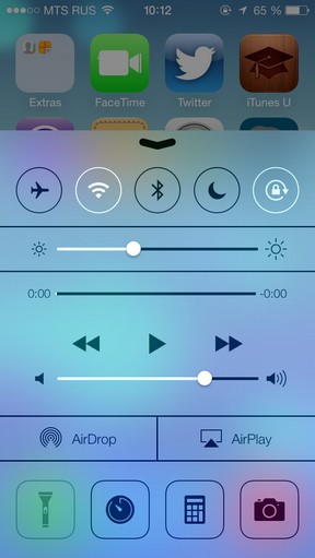
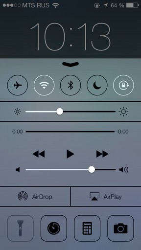
We were not mistaken: this is the name of the new Contol Center feature in the Russian localization of iOS 7. Control point is a pink dream of all those who installed a jailbreak for the sake of the SBSettings panel, which allowed to quickly turn on and off the useful functions of the device. The control point is called at any time from the bottom of the screen, and you can turn it on and off in it:
- - Airplane mode
- - Wi-Fi
- - Bluetooth
- - Do Not Disturb
- - Screen orientation lock
In addition, in the Control Point, you can adjust the brightness of the screen, control the playback of player songs, the volume of the device, and also include AirDrop and AirPlay. It can be seen that Apple wanted to shove a maximum of opportunities here. Because that's not all! At the very bottom you can turn on the FLASHLIGHT . This is victory!
Well, seriously, Apple in one fell swoop killed an entire category of App Store applications. Next to the flashlight there are buttons for switching to the alarm clock, calculator and the Camera. By the way, the camera is also on the desktop. And on the lock screen. Is not it too much?
New in standard iOS apps
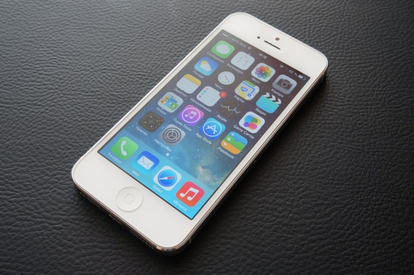
From the old design in them there is nothing left. That is, everything that was before was taken in one big sack and divided into zero. Between all programs the same tendency is traced: the white background dominates over black as wants. Think what you want.
Posts


The general screen of dialogues is remotely similar to the old one. In the dialogues themselves there is no longer a "fabric" background and glare on the message clouds. Changed and their colors: your messages are highlighted in blue, and incoming - gray.

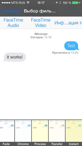
Dialing the text of the interlocutor is confirmed by an animated ellipsis at the site of the future message. And the submit button does not change now depending on the outgoing type. If you are sending iMessage, a corresponding statement will appear at the top of the screen and in the input field. From the top panel, you can call up the FaceTime call menu, including without video, and view or edit the contact.
The calendar
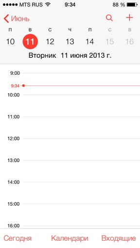
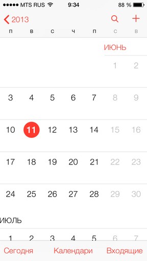
The new calendar design simultaneously reminds both Android and Windows Phone. The principles of work have not changed much, but the design has become noticeably different. Minimalism and circles. The red color scheme completely coincided with the previous rumors. Below there are tabs that are transferred to the schedule of today, in the calendar menu and in the inbox of incoming invitations.
A photo
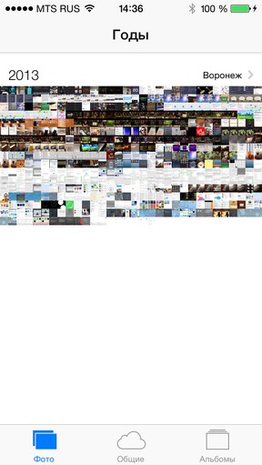

By default, photos are sorted in the Collection by date of creation - by year or by small intervals of days. If you enable geolocation, the pictures you made can be viewed on the map with pins in the places where they were created. The idea of the Collection is similar to the albums of social networks. But most of all on these same networks is like the second tab, General .
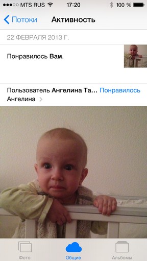
Here you can see all the latest actions of the owners of the photostreams to which you are subscribed. Events are scrolled down and folded in the manner of Facebook, Vkontakte and Flickr combined. Only with the word "Liked" instead of the visual button "Like". The idea is live, and if you have friends with the iPhone, now it makes sense to help them set up their own photo stream and subscribe to it. And you look, a new social network will be born.
And still here you can apply new photo filters from the Camera. It's even more convenient.
Camera
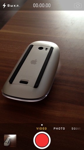
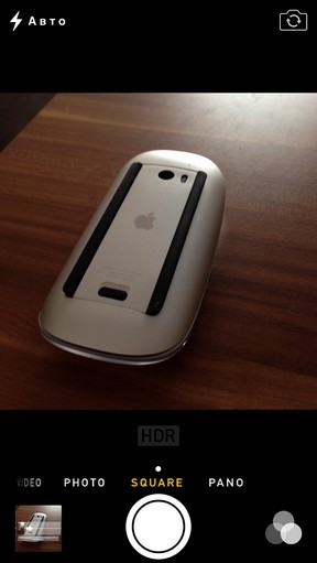
Do not like Instagram? I want to see your face when you open the camera iOS 7. From the application it's fanning "vanilla", which is able to draw all hipsters in the area. For example, there was a new mode of taking pictures with cropping the frame to a square one - exactly for social networks and an itagram.
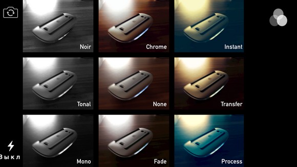
New photo filters are superimposed on the picture in real time, even before the shooting. There are nine in all, and most are sad . Yes, and the application version is not very convenient: after all, the choice of the filter is an extra gesture, and during this time a good frame can be missed.
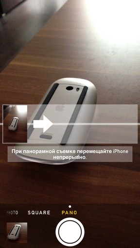
Animation "shutter" when changing the shooting mode was changed to a blur effect. The utility is zero, but it looks funny. In general, the new Camera is very unlike itself, even more than other applications of the system. On the radical nature of the new design, it can only be rivaled by the new Game Center.
Game Center
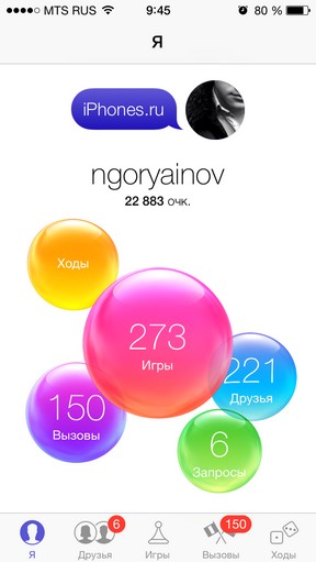
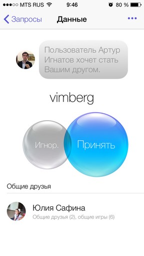
There is such a console at Sony - Playstation Vita. And in Vita there is an interface of multi-colored balls. Jonathan Ive is known for his love for Sony. So do not be surprised by opening a new Game Center in iOS 7. Because there are some balls here. Everywhere . And they move a little, just like ... well, you understand.
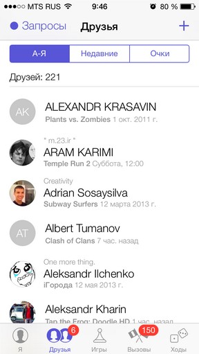
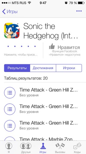
Balls denote the menu-installed games, friends list, add requests, duel calls and moves for turn-based games. All this can be opened through the tabs below, so the reason for duplicating the function is not entirely clear. It seems like not Android and not Windows ...
Bubbles fly in different directions when you open any other tab. Apparently, the core of Game Center functions remains the same. Only now is there no hint of card games, cloth and so on. White background, game, spirit of rivalry. And constantly moving soap bubbles. It is a pity that they can not be scattered around the screen - this feature was missed ...
Weather
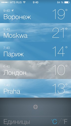
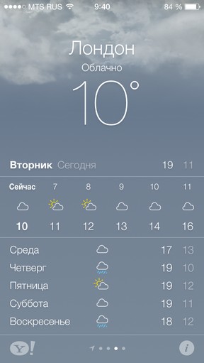
About the weather, I would like to add only that some Russian cities are not translated into Russian. For example, Moscow is written in transliteration. WTF ...
App Store
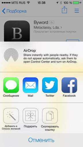
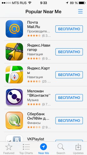
The cradle of iOS success has undergone the expected changes at the interface level: simple tab icons, white and blue panels ... But there's a brand-new feature - Next to me . This menu, which shows applications that are popular near you. In my case, they were clients of Mail.ru and Vkontakte.
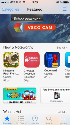
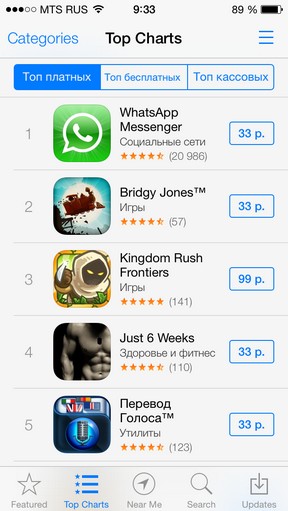
There was a new gesture of return to the main menu with the help of the Svayp from left to right. And in the corner finally found a wish list, like in iTunes for computers. Adding to it any application store, you can quickly track its price and download as soon as you deem it necessary. Maybe that's why Apple vehemently removed discount aggregators?
Apple Maps
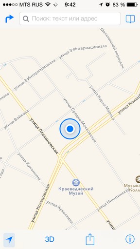
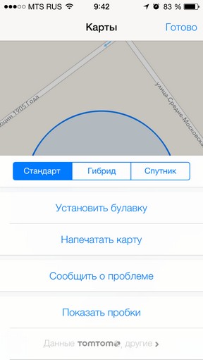
The service itself has not changed, but the interface has become a new minimalist theme. These buttons without signatures require addiction, because a person from the outside will not understand what the square with an arrow means, a book, an arrow in the corner and the arrow to the right. These people did Interface Guidelines , which in different forms were accepted by all developers of mobile software. What caused Apple to change itself is unknown. Continuing the topic ...
Safari in iOS 7
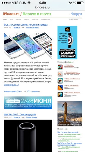
Each of us has his favorite application. I have Safari, and many also. So when I opened Safari in iOS 7, I felt uneasy. Then we visited our old friend, redesign, and after it stayed ... Android.
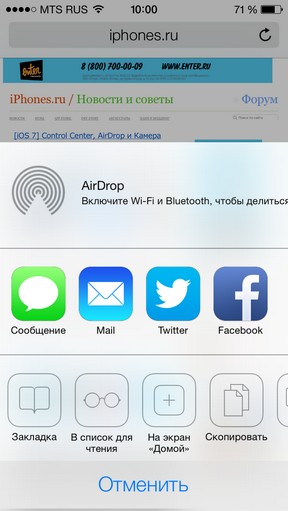
No seriously. The lower panel of the new Safari looks almost identical to the one in the most popular OS in the world. These subtle, extremely schematic buttons are not signed and therefore incomprehensible. For example, the "square with the arrow" brings up the AirDrop menu, at the bottom of which there are the usual buttons for adding to the bookmarks, the list for reading and the screen Home.
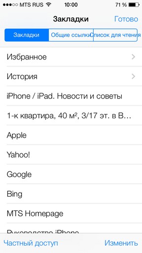
IMG_02591.jpg "alt =" iOS 7 Scalable View "title =" iOS 7 Scalable Review ">"Book" means the Bookmarks menu, which has a tab for links from your Facebook and Twitter tapes, which is quite handy if it's too lazy to open the clients of the services. There is also a list for reading.
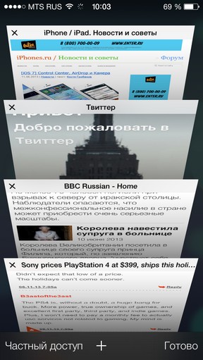
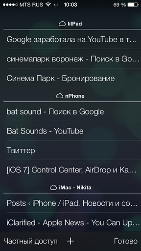
The juice itself is a new menu of bookmarks, designed as a box with ordinary folders for paper documents. Bookmarks reflect the open page. The effect is excellent. If you scroll down, you can find cloud bookmarks - the ones that are currently open on your other Apple devices. In my humble opinion, this part turned out best for Apple.
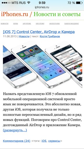
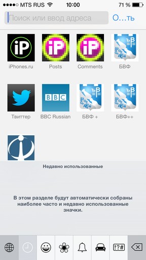
A separate search string has been deleted. Now requests are entered in the same field as the site addresses. When you click on it, the menu of the bookmarks panel opens, designed as a grid of pictures with captions. Interesting and convenient. Next to the field is the button for enabling the Reader mode.

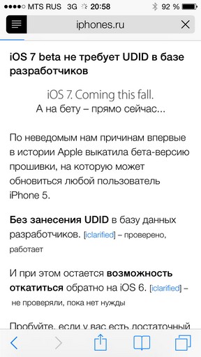
When you start scrolling through the loaded page, all Safari menus disappear. Triple cheers full-screen full-screen mode.
Calculator
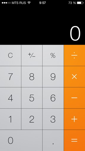
Take it away immediately. Take the icon with you.
Contacts
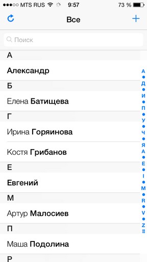
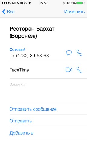
All the significant changes here concern design. Contacts pages look fresh, and phone numbers are immediately noticeable. A rare case when you can only agree with the redesign. Unfortunately, at the moment the Contacts menu works with noticeable brakes - just like Reminders in the first beta version of iOS 6.
Reminders
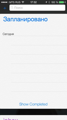
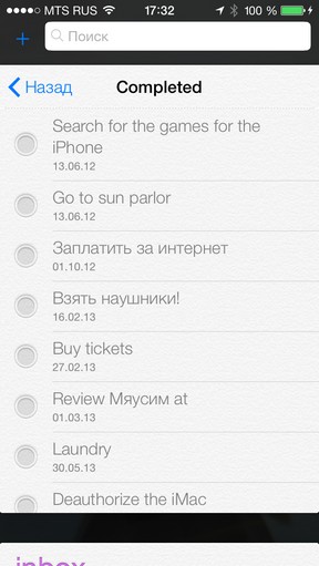
The list of reminders was obviously made by another person, because only in it a realistic paper texture was preserved. Items are now confirmed by a point, and between lists you can "jump" by clicking on their title. The purpose of this application is not very clear, when there is a Calendar for events and Notes for notes, but it is here that the reminders for Siri are added.
Siri
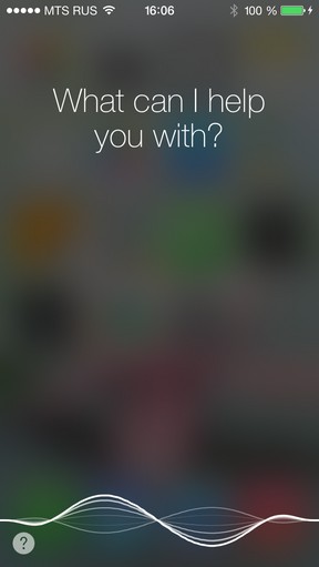
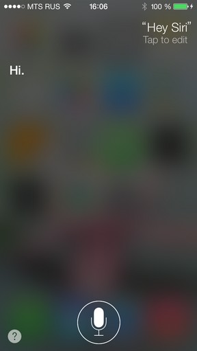
I do not know what Apple did, but now Siri does speak much better than before. The intonation is expressed brighter, speech is put better - if so it is possible to speak about the robotized voice. Yes, and the voice itself was a little more pleasant.
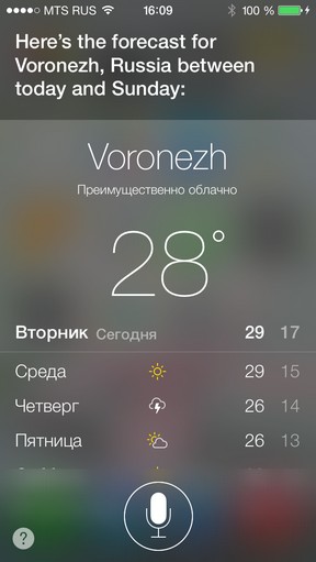
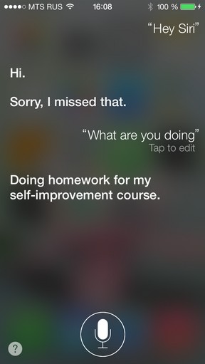
As is known, now Siri can launch applications, disable Bluetooth and so on. New features are not as interesting as the new format for presenting data. From skvevomorfizma nothing remained, and the menu of the service it went only to the benefit.
The new design is beautiful. But the requests are processed more slowly, and the interface itself significantly slows down. Moreover, the system has become worse to determine the requests themselves. It is necessary to repeat. In general, there is something to work on for future beta versions.
Compass
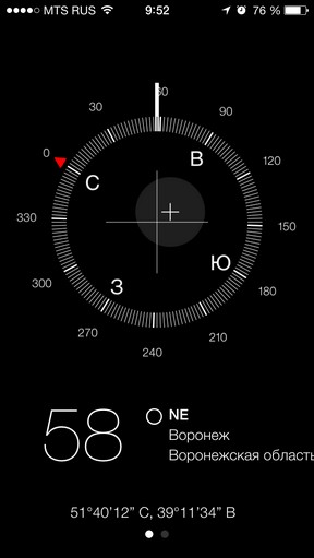
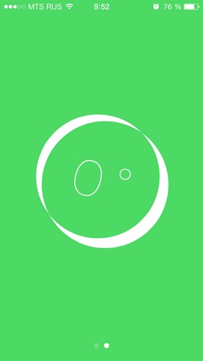
The useless toy, which appeared along with the iPhone 3GS, was the leader in the speed of disappearance from the first screens of the iOS desktop. Apple did not remove it and made it extremely hard. Instead of the "eight" in the air, to calibrate the compass now you need to twist the phone itself. In addition to the obvious, the program now shows the center point and even the deflection angle, and in a separate full-screen tab. The black background is only here and in the Promotions.
Promotions


If you traded on the stock exchange, you are unlikely to use the shares in iOS. Now the data is updated in real time, so the utility of the program has been strengthened by about 15% with little potential for further growth. Courses, as before, come through Yahoo! Finance.
Kiosk
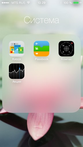
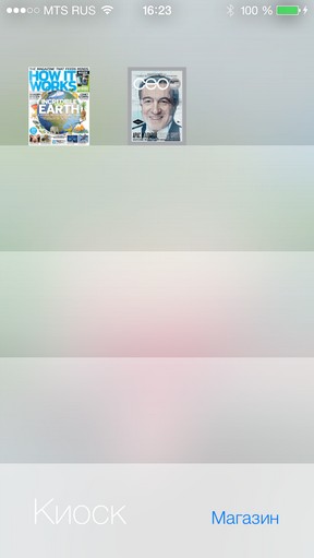
He is cleaning up the folder. YES.
Oh, yes, instead of shelves - light rectangles with gradients.
Phone
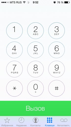
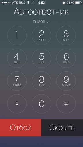
The previous number pad did not like many people, but now more people will want to return to it. And in vain! New buttons - light and round, click on become transparent and reveal the background image. You can not miss the button at all.
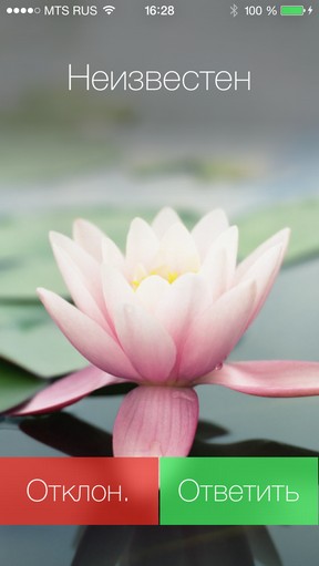
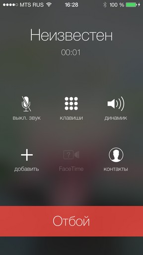
This is the window for receiving / rejecting an incoming call. If you type a contact from your address book, its avatar will replace the blurred background image.
Black list in iOS 7
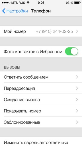

Nothing was said about it anywhere, but it does exist. To add any number or Apple account to the black list, just create an appropriate contact and add it in Settings in the Blocked menu. More this person will not disturb you, and his calls and messages will not even be displayed.
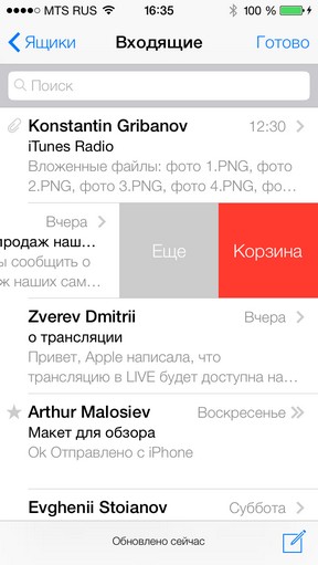
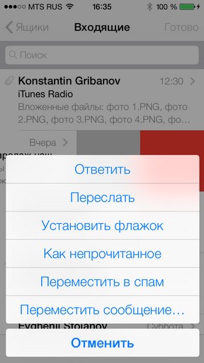
Mail in iOS 7 strongly resembles the Mailbox client. Managing messages is done using the svayp to the left, which opens the transfer menu and notes, and also allows you to delete the message. Useful trifle, freeing up space on the screen.
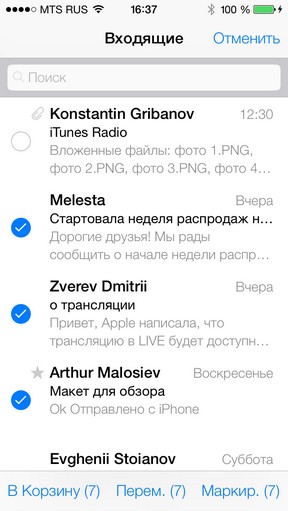
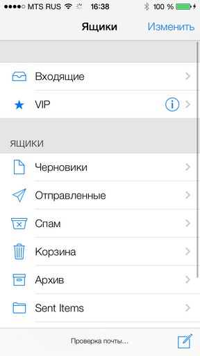
In the rest the mail client remained the same, excluding, of course, a comprehensive redesign. They also touched the well-known "snot" Pull to refresh , which has now become a "daisy", similar to that shown when the iPhone is turned off.
Music
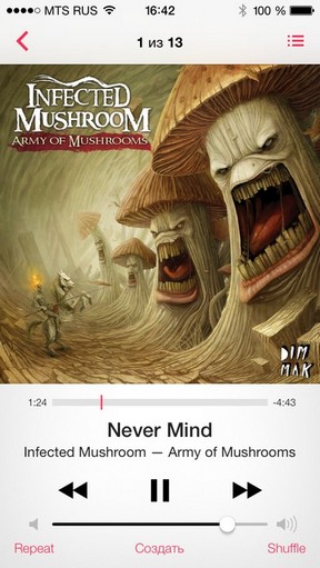
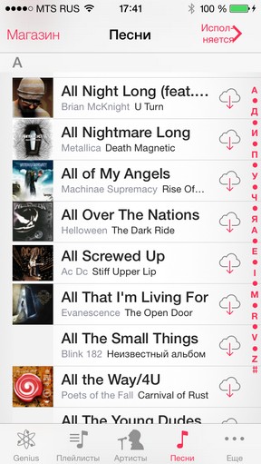
The interface of the tabs at the bottom and their editing have been preserved. That's all that's left of the previous music player. The new shines with a white background, control keys at the bottom of the screen and much more images. Now the picture of the album is shown even in the list of songs.
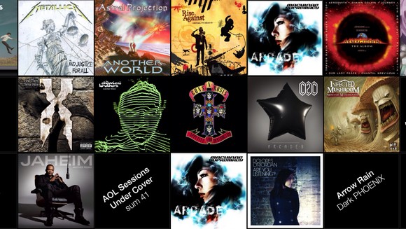
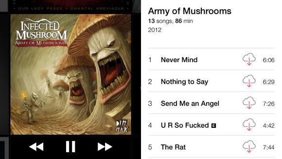
Cover Flow disappeared, and in its place came a grid of albums.
On Stability
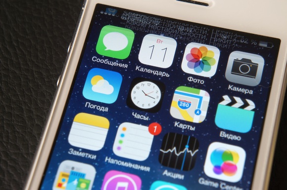
Sincerely, we do not recommend you to install iOS 7 right now. At the moment the system is very raw:
- - Standard applications crash for no apparent reason and without persistence;
- - From time to time the system reloads the desktop, closing all applications;
- - Many third-party applications do not work properly, incl. Skype;
- - The battery is discharged by 30-40 percent per hour of intensive work;
- - The overall system performance is significantly lower than iOS 6;
- - The weight of graphic bugs and glitches.
In addition, many elements on the screen are either not translated, or clearly not yet completed. There are not enough accompanying images in many menus. Localization in Russian is far from decent: the text is crawling on each other or does not fit into the buttons, and in some cases it is also transferred to another line. Nobody promised that everything would be fine and convenient - but the fact that the beta version can be installed without a developer account will necessarily lead to a lot of dissatisfied reviews.
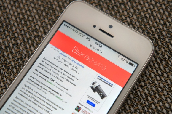
Instead of output. July 24, the first beta version of iOS 7 will stop working and turn the device into a brick. If the next update is tied to a UDID, thousands of negligent beta testers will be forced to lose all system data at the most inopportune moment. The game is not worth the candle, if you do not have a second, spare iPhone.
Conclusion
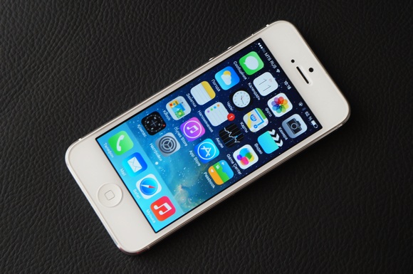
Tonight I put aside the iPhone with the seven and thought about it. We were so eagerly waiting for a new design that missed the whole point of iOS 7. These scary, cheap, absolutely substandard icons caused a flurry of fair criticism on the Web. But the essence of what happened is in another. After all, you can change the icons. And gradients too.
After a large-scale acquaintance with iOS 7 it became obvious: Apple did not want to make a banal redesign of the system. Did not want to change the style or pictures. And it is unlikely that she was waiting for the adoration of her fans, because she did what most of them did not want. The development of the system was constrained not only by the old principles imposed by Scott Forstal, but also by the stale and lazy minds of experienced iOS users who for years have been crying about stagnation, but are accustomed to it. And suddenly they were afraid of change.
To do something new, you need to break the old one. Apple started the history of iOS from scratch , leaving only the outlines of icons and general ideas. Only this way it was possible to return to the path of innovation and breathe a spark. And whining of retrogrades will not be interesting to anyone tomorrow. In the end, they are always waiting for iOS 6, Android and Windows Phone.
Today Apple unceremoniously destroyed six years of the evolution of iOS design. Destroyed with an extraordinary, uncharacteristic cruelty and consistency. IOS 7 is not like anything and at the same time it looks like everything at once. Here you and the elements of Windows Phone, and the ideas of Android, and the light whisper of the late WebOS. Issues of morality and honesty will be asked for a very long time. In the meantime ...
PS: And what did you find? Share in the comments!


Comments
When commenting on, remember that the content and tone of your message can hurt the feelings of real people, show respect and tolerance to your interlocutors even if you do not share their opinion, your behavior in the conditions of freedom of expression and anonymity provided by the Internet, changes Not only virtual, but also the real world. All comments are hidden from the index, spam is controlled.