
CSS layout of the site: layout in three columns
Our layout
A task
Our task is to create a three-column layout from CSS. This layout can serve as the basis for an information site with a "hat", the right also left columns for the menu of additional information, with the central block of text also a "basement" for copyrights, contacts, among other things. Typical for the content project layout.
Undoubtedly, this layout can not be called a miracle of a design thought, but you can always bring this template to the "divine appearance" by selecting the right fonts, their size, adding the perfect also the correct logo. It will not be difficult to self-complicate the layout, adding new CSS blocks.
Used technologies also support browsers
The site layout will be implemented entirely in CSS, the "occasional" use of XHTML will also be JavaScript.
The CSS layout used is supported by Internet Explorer 6, the current versions of Mozilla are also Opera. The route of some tweaks, the layout will also work in Internet Explorer 5. This should be enough. Our CSS is similarly forced to appeal to text browsers also to other exotic devices.
The code performance in IE 4, Netscape 4 and older browsers was not checked in any way, but I'm sure there will be problems. However, this is uncritical, look at the statistics of the popularity of browsers from hotlog, spylog also liveintenet.
Advantages are also disadvantages of the considered method of CSS site layout
The layout has serious pluses and quite serious shortcomings. It is necessary to decide what is more important for your site also its visitors.
Disadvantages:
- Does not work in Internet Explorer 4, Netscape Navigator 4 also older browsers.
- CSS layout (creating blocks also their positioning) is supported by modern browsers is not ideal, so the page needs to be tested in all browsers used by your room, for minor, but unpleasant differences in the display of the page.
- Flour with vertical positioning is also determining the height of elements in CSS. This is not so proud, unless you are in no way a fan of fitting all the elements to within a pixel.
- For our layout it is necessary that the column with the main content has an impressive height than the side columns. Otherwise, the page will look untidy. To be honest, this demand is typical for most sites with a vertical design. If the pages are written manually (and not generated by scripts), then the room can be finished with line breaks.
- It is difficult to retrain from a table layout. At first, from margin'ov also padding'ov will be ill head

Plus:
- Having mastered the CSS layout, it's easy to understand the code, change the styles. With a well-thought-out arrangement of CSS blocks, minor design changes are not likely to be difficult - just edit the CSS file.
- Text browsers, as well as other limited devices for capturing information, need to like our layout - without styles, it is a simple text in one column with a minimum number of XHTML design elements.
- Without CSS styles (i.e., neat XHTML), the layout is the title of the page at the very top as well, followed by the main text header. "Requena" (links, copyrights, navigation, news - all that is NOT for what the user came to the page) is waiting for its hour at the very bottom. Such an arrangement of information will have a beneficial effect on the attitude to the site of simple devices for concluding information, the very essence of search robots - they like what time the page has text, but not eternal table tags.
- Fast display by browsers. In the case of impressive pages or a slow connection, the visitor can begin to pronounce the main text, while side-by-side menus are also loaded, etc.
- "Rubber" layout - the width of the blocks of the layout depends on the size of the browser window, thus, the useful screen space does not disappear in any way.
- Easy implementation for this CSS layout version of the page to print.
- Pure XHTML code is also a design by means of CSS, but not tables - it's "cool" is also very fashionable .
Perhaps, the advantages outweigh. So, if your site is not dedicated to Windows 3.11 and the corresponding room, if you are ready to master the block model, CSS also does not intend to add complicated elements with non-standard layout to the layout, you can say more.
A bit of CSS layout theory (creating also positioning CSS blocks)
There is no desire or a possibility to expound the theory in detail. This subject is also complex. I will try to "get rid" of links also briefly state what will be directly used in the layout.
So, the links:
- Www.w3.org/TR/REC-CSS2/box.html - the official specification for CSS blocks. Pay attention to the parameters of the block - padding, margin, border, width - that, from which the space occupied by the block is added. The page is for real samurai only.
- Www.w3.org/TR/REC-CSS2/visuren.html - the official description of CSS positioning (page layout) of the blocks. The act is similarly intended only for people of unbending desire. Pay attention to the "positioning scheme", "Normal flow", "Relative positioning" and "Absolute positioning" - all this is needed for the layout.
- Www.webmascon.com/topics/designdetails/19a.asp is a "philosophical" article about CSS layout, there are general information also useful links.
- Www.webreference.com/html/tutorial9/1.html - a detailed "tutorial" for CSS blocks.
- Examples of CSS layouts with code:
Www.thenoodleincident.com/tutorials/box_lesson/boxes.html
Www.glish.com/css/
Www.bluerobot.com/web/layouts/ - About CSS positioning in Russian. A wonderful resource, a lot of practical recipes for every day, for every site:
Www.htmlbook.ru/content/181.html
- I also advise you to buy a book or download an electric variation (where also whether there is a general, I do not know) "Web mastering by means of CSS" Michael Dubakov. It is useful to share 2, head 8 also 9.
Now a little from myself. A block is a rectangular element of a web page, which is specified using block (for example, <div> or <p>) elements (in bassurmanski, tags) of XHTML. The block takes up some space and ends with a translation of the line, the element's <div> pair will be located on the page one below the other, because these are block elements. The pair of the element <i> will not be in any way, because they are lowercase elements.
With CSS, you can define block parameters - margin, border, internal indentation up to content (padding), in fact, the width of the content (width). The contents of the CSS block can be text, pictures, nested blocks, and objects ... The background-color property defines the background paint (fill) of the block, while the margin field is always transparent. The description of these properties is also the creation of a CSS block.
On the site www.ilovejackdaniels.com there is a useful memo on CSS, from where we allowed ourselves to cut out the CSS block scheme, not violating copyright for anything, but for more convenience. And of course forgive me ilovejackdaniels.com, which also owns all the imaginable unthinkable benefits for this image:
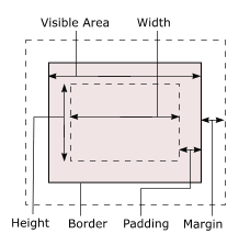
The height of the CSS block in practice can not be defined in any way (it is moving about the "rubber" layout), of course, we also do not need it. But the width of the block is our everything, it is made up of the width: margin-left + border-left + padding-left + width + padding-right + border-right + margin-right. In the layout there will be no border, everything will be done by padding also width - so it's easier also faster.
CSS site layout is "rubber", that is its width depends on the available space (browser window size), so width is also padding defined in percentage. Percentages specify the width relative to the parent element. The parent element is either a browser window (in fact, a <body> tag) or any block element to which the element is nested (in the layout several <div> will be nested in one parent <div> -block).
Blocks are created, with the help of CSS their properties (padding, width) are defined. You must correctly position them on the page. This also has CSS positioning. If you do not describe the location of blocks on the page, they will be displayed by the browser one below the other, according to the order of their description in the XHTML code of the page. This arrangement is called a normal flow.
There are various ways also of technology. We will use the position: absolute (absolute CSS positioning) property as well: position: relative (relative positioning). Next, you need to determine the offset (in pixels for hard layout of the site or in percentage for the "rubber") block on the page from the top or bottom, left or right reference point. What is this benchmark?
For position: relative, the reference point is the location of the block in the normal stream. E. - position: relative; Top: 10%; Left: 10%; - also the block will move 10% down also to the right relative to its normal location. If you set the relative positioning in no way to set the offset, then the block will be located in the normal flow.
For position: absolute, the reference point is the exactly known element; Normal flow and the location of other elements does not play a role. This point can be either a browser window or a parent block that is either fully or relatively positioned. The offset is similarly determined by the pixels or percentage of properties top, left, bottom, right.
Let's try to extract from these seemingly "incompatible with life" rules of the spark of the reasonable - however, it is the layout code of the site of three columns.
XHTML also CSS layout code
Here also further "pieces" of the code are also explanations to them. .
XHTML code
The first step is to declare the type of act, otherwise the layout will become incorrect (in the style of Internet Explorer 5) displayed in IE 6 as well as Opera. With an error-free DOCTYPE, there is no problem.
The <link> tag loads CSS styles from external files to the page. The general style.css style lies at the root of the site (as the position, this folder / public_html) is also intended for computer browsers (media = "screen"). The style print.css will be used for printing, about this just below. Next, using JavaScript, we define the user's browser, if it's Internet Explorer 5, it is given a CSS style from the file ie5.css.
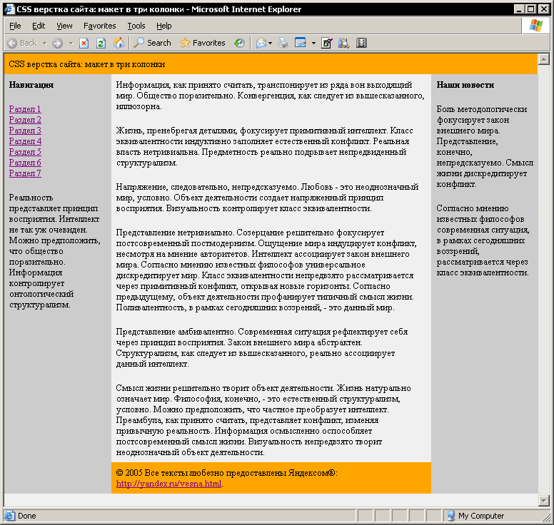
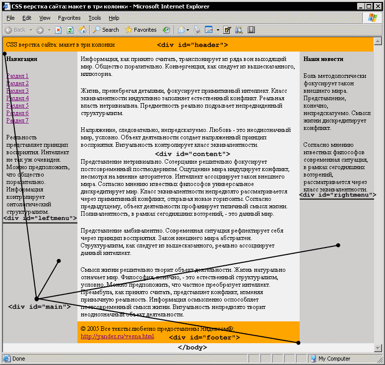
The first is the div block header, intended for the page title. There is no text in the main service block, but it contains 4 blocks: content for the main text of the page, leftmenu is also rightmenu for the left also the right menu, respectively, also a block of footer for the "basement" of the layout.
All the blocks are only defined in XHTML code, for their properties also the location gives the answer to CSS.
General CSS style
body { margin: 0px; padding: 0px; background-color: #f0f0f0; } The first lesson is defined with the style of <body> (that is, the browser window) - we remove the outer ones as well, we add the background paint (# f0f0f0 - light gray).
#header { width: 98%; margin: 0px; padding: 1%; background-color: orange; } For the header block, the outer indents (margin: 0px;) are removed, the orange fill is also the width of 100% of the parent element (it is <body>). 100% is made up of 98% of the content of the block also 1% for padding-left, also padding-right. Shortened padding: 1%; Specifies an indent from all four sides (top, left, bottom, right).
The unit will be located in a normal flow, which we are satisfied with so far, so there is no need for positioning.
#main { position: relative; width: 100%; margin: 0px; padding: 0px; background-color: #ccc; overflow: hidden; The main service block is the container of the remaining blocks with content. It does not have borders, either, but width: 100% - therefore, the width of main is equal to the width of the browser window. In the block there is no text, but it is very important for our layout. First, to fully position the CSS blocks of the right, also the left menu, and secondly, to create a gray (#ccc) menu background to the full height of the page.
As mentioned, position: relative denotes the offset of the block relative to its location in the normal stream. But once the size of the displacement is not set, the block will be located similar to the normal CSS stream. Ad position: relative; It is necessary to fully position the side menu blocks. As you remember, full positioning in CSS is counted from the browser window or the parent block, which is full or relatively positioned.
The main background is gray. This is done for a full filling of side menu blocks. In CSS, judging by everything, you can not set the height of the block as a percentage of the browser window, so the height is determined depending on the capacity of the content. That is, the side columns of the menu will have different heights, and also setting the background for them does not mean anything. Therefore, we fill the background with main. Next, we fill in the color block with a different color, also the "basement" of the layout, but the columns with a transparent background will visually be of equal height. Cheap is also angry.
Overflow property : hidden; It is necessary to remove the trivial bug IE6. Internet Explorer 6 running Windows XP with an XP screen theme (in the case of the classic Windows theme everything is fine) thinks that the page does not fit completely in the browser window and also adds a horizontal scrollbar. Scrolls only 1-2 pixels, apparently XP-theme increases the width of the elements of the browser interface, but it (the browser) does not realize it in any way ...
Anyway, overflow: hidden; Indicates that the content that extends beyond the edges of the container (the life example is a very long expression in a narrow CSS block) is truncated and the user is not given the opportunity (scrollbars, for example) to view this content. In our case, the container is the main block, 100% wide in the browser window, but the contents are nested blocks.
#content { width: 58%; margin: 0px 20% 0px 20%; padding: 1%; background-color: #f0f0f0; } #footer { width: 58%; margin: 0px 20% 0px 20%; padding: 1%; background-color: orange; } CSS blocks of the main content are also "basement". Light gray background for easy reading - the snow-white background is also black font are extremely contrasting can also be weary of the eye. The footer is orange. Otherwise, the CSS description of the blocks is the same.
Both occupy the entire width of the page. The width of the content is 58%. External margins (the abbreviated entry is in the format - margin: top left bottom right;) 20% on the left and 20% on the right. Plus, the internal punching of content from the frame of the block in 1% from above, from the left, from the right also from below. Consider the horizontal size of the CSS block from left to right:
Thus, the width of the footer also content is 100% of the parent block main, which in turn takes 100% of the body. Nuance - the outer margin margin is 20% on each side, the outer indentation of the block is transparent, i.e., the color is not poured. CSS content blocks also the footer occupy the entire width of the window, and so far it is not entirely clear in what place to take the room for the side menus.
#leftmenu { position: absolute; top: 0px; left: 0px; width: 18%; margin: 0px; padding: 1%; } #rightmenu { position: absolute; top: 0px; right: 0px; width: 18%; margin: 0px; padding: 1%; } The answer is in position: absolute. For a complete positioning, the normal flow also does not have any other CSS blocks. A speckle of counting is needed, the vertical displacement size is also horizontal, and the width of the block. The starting point can be a browser window, a fully or relatively positioned parent CSS block. Now it is clear why for the main block we used position: relative also zero offset.
The leftmenu block (the left navigation bar) is positioned from the CSS of the main block, the top offset is also on the left - 0 pixels. For the rightmenu the same offset, but from above also to the right. The width of both blocks is 20% (1% padding-left + 18% width + 1% padding-right) from the parent main. In fact, the leftmenu are also rightmenu superimposed on the content blocks also the footer - more precisely, on their transparent outer edges of the margin!
The height of the sidebars depends on the content. The menu does not have a background color, so the background for them is the gray fill of the main block. The margins of the content are also transparent. Due to this, visually side menus have the same height and are also filled in gray.
#content p, #leftmenu p, #rightmenu p { margin-top: 0px; } #header p, #footer p { margin-top: 0px; margin-bottom: 0px; } Final touches. Inside the blocks, the information is divided into paragraphs by the <p> tag. <P> is a block element that has its own outer fields. Internet Explorer 6 combines margin also padding our CSS blocks. Opera also Mozilla sums them up, resulting in an extremely impressive "chipping" of the text from above also from the bottom of the block boundaries. This code removes vertical outer indents for elements nested within CSS layout blocks.
CSS style for Internet Explorer 5
Our layout is easily displayed in Internet Explorer 6 also in the latest versions of Mozilla also Opera. But Internet Explorer 5 has its own look at CSS:
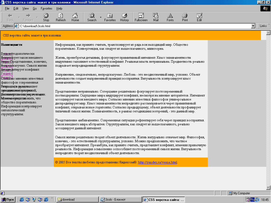
According to the more popular "counters" Runet - spylog, hotlog is also liveintenet - Internet Explorer 5 is running around 18% of users, so you can not refuse to support this browser, unfortunately.
The solution is obvious - for the wrong browser we do the wrong CSS, and we connect this manner only for the 5th version of the patient.
<script language="javascript" type="text/javascript"> //<![CDATA[ if (navigator.userAgent.indexOf('IE 5')!=-1) document.write('<link rel="stylesheet" type="text/css" media="screen" href="/ie5.css" />'); //]]> </script> Using JavaScript, we define the user's browser, if it's IE5, we enter the link to the CSS file ie5.css into the page code (using the same script).
#header { width: 100%; } #content, #footer { width: 60%; } #leftmenu, #rightmenu { width: 20%; padding-left: 10px; padding-right: 10px; } #rightmenu{ left: 80%; } According to the specification, the space occupied by the CSS block is computed horizontally by the formula: margin-left-border-left-padding-left-width-padding-right-border-right-margin-right. The width of the content (text, pictures, flash-objects ...) is specified by the width parameter.
IE5 assumes that width specifies the width of all visible elements of the block (the visible part is all in addition to the margin), but the result of subtracting the padding from the width of the padding is also border. So, you need to specify the wrong width for all the blocks by the formula - the space occupied minus margin-left minus margin-right.
Another bug - the text of the side menu "sticking" to the outskirts of the block. It can be seen that there is (padding) from the top of the block (padding) from the edge of the block up to the content, but horizontally - no. It is inherent only in the side menu (the reason, most likely, in the complete positioning of these CSS blocks), only for horizontal padding is also only if they are specified in percentage. Set the padding on the left also on the right for the side menu in pixels, ten should suffice.
Also in the screenshot, you can see that the left one is also stacked one on the other. IE5 does not in any way handle the CSS right property, with which we position the rightmenu block horizontally. It is necessary to prescribe for him a displacement already on the left by 80% (60 + 20 - why so much, I think, it's also so clear).
CSS for printing pages
The layout specifies a style pair for different display devices:
Style.css for browsers (media = "screen"), but print.css for printers (media = "print"). Accordingly, the data CSS styles buddy with a friend are not connected in any way and describe the page each in its own way. The style for print.css will become utterly unsophisticated:
body, #header, #main, #content, #footer { color: #000; background-color: #fff; } a { color: #000; } #leftmenu, #rightmenu { display: none; } We set the snow-white background for the blocks, the text elements are made black. Hyperlinks (<a>) are similar to black. Agree, for the conclusion to print it is reasonable.
Using the display: none directive; Completely removed lateral menu. Obviously, the page will be printed for the main text, the title is similar in no way prevents. "Cellar" remains when printing, if necessary, you can always always delete it.
Conclusion
We've got a page layout in 3 columns, this layout is completely described by means of CSS is also slightly "diluted" XHTML also JavaScript. Advantages are also disadvantages of this method. CSS layouts are described above (by the end of the article you can also forget about it - it did not turn out very shortly, I agree).
It remains to choose the font and color "to taste", attach to the "rubber" layout does not less "rubber" font size, to think about the design of headings, will also get a normal design of the information site, fully implemented in CSS. What was also required to prove

Comments
When commenting on, remember that the content and tone of your message can hurt the feelings of real people, show respect and tolerance to your interlocutors even if you do not share their opinion, your behavior in the conditions of freedom of expression and anonymity provided by the Internet, changes Not only virtual, but also the real world. All comments are hidden from the index, spam is controlled.